Kelvin Taylor takes us on a design tour of Hong Kong. We find new streets, a critique (well more of an appreciation) of the renowned Pacific Place and a pair of sneakers at $15,500 a pop! He reckons it’s all worth it!
“The details are not the details. They make the design.”
This Charles Eames quote was a constant reminder on my recent trip to Hong Kong, where I was fortunate enough to spend a few days reviewing the retail and shopping centre scene.
Design icons Charles and Ray Eames sketched their famed design diagram to explain the design process of achieving a point where the needs and interests of the client, the designer and society as a whole, can overlap. It is in the area where all three elements overlap that the designer can work with enthusiasm and conviction. From this point of understanding, wonderfully creative, unique and ground-breaking design outcomes can be achieved. Here, problem solving and innovation are at their best.
Walking around Hong Kong it is easy to be disarmed by all the bling and lights, glitz and glamour. If you look deeper, you can find the beautifully crafted architecture, interior spaces and fine grain detail that reflect Hong Kong’s rich heritage and future thinking – where design adds value to both the visitor and resident experience.
One of the most valuable pieces of real estate in the world is Pacific Place, developed by Swire Properties. The complex comprises three office towers, hotels (the Conrad, Shangri-La and JW Marriott), five-star serviced apartments and a four-level shopping centre featuring 130 shops and boutiques and a Harvey Nichols department store.
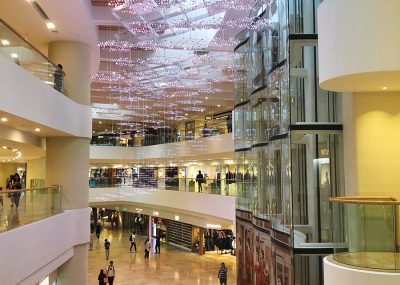
Lee Tung Avenue and below Pacific Place, Hong Kong
UK-based Heatherwick Studio, lead by innovative designer Thomas Heatherwick CBE, undertook the task of transforming the experience and operations by addressing circulation and wayfinding, improving sightlines, introducing a new palette of materials, textures and detailing, and reducing energy consumption. The greatest transformation, executed with a subtle touch, is the reconfiguration of the top of the retail podium that forms the ground level of the office towers called the ‘Avenue of Light’.
Heatherwick developed a walkable seven-layer flat glass skylight treated with a three-dimensional form to create an anti-slip surface. Along with the sculptural roof detail of the adjoining restaurant, the result is understated and classically stylish as well as highly functional in the way that the natural light now floods the mall spaces.
At a more personal level, a critical factor in providing good customer experience at any large public space is the restroom design. Here, Heatherwick Studio was very clever in the development of the humble toilet door hinge. Instead of the standard square cubicle, the design team enclosed the basins with a single undulating timber skin that bent and opened without any visible hinge or line. Other areas where total detail and precision execution are visible is the lift panels, ceiling details, dwell zone benches and street curbs. Everywhere you look, there is attention to detail that makes up the design.
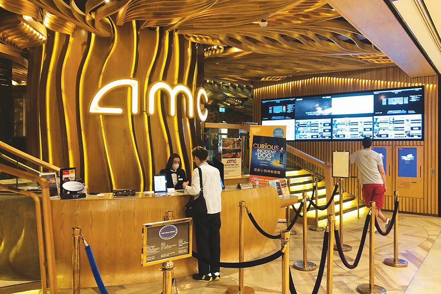
AMC cinema in Pacific Place
AMC cinema in Pacific Place is an organic and sculptural design that takes the visitor into another world. Designed by Hong Kong design practice James Law Cybertecture, the cinema is markedly different from traditional cinema designs with its interpretation of kinetic spatial design, which serves to blur the lines between form and function. Inside, the walls of the Cybertecture cinema comprise sculptural, organic shapes moulded together to form a U-shaped corridor, creating a journey of discovery at the entrances of each cinema auditorium.
The organic ceiling formed of bent wood carries a river-like pattern that is carried throughout the foyer. The same pattern is also reflected on the floor treatment featuring thin stainless-steel embedded into the floor to give a directional glance for the audiences to the auditorium. Each theatre offers movie-goers the ultimate in design and luxury.
The auditorium entrance is marked by a scribed number set into the wall that is lit by LED lighting, with all facets of signage reinterpreted as part of the architecture.
Large-scale façades and shopfronts are also a prominent feature in Hong Kong retail where design creativity, innovation and style are heralded.
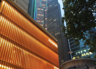
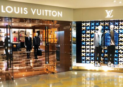
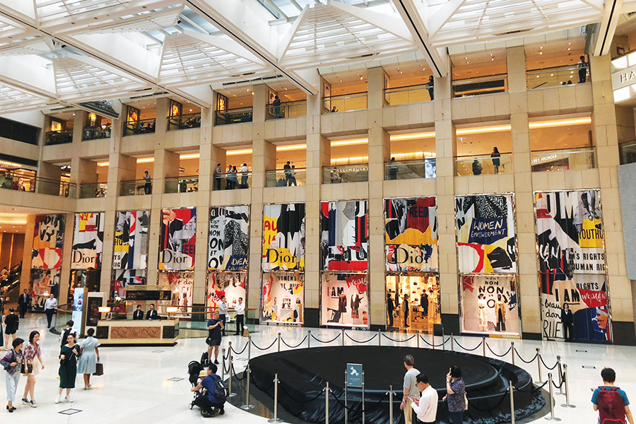
Brands like Hermès, Dior, Chanel, Louis Vuitton and Gucci feature prominently on the streetscape with bespoke architectural façades that feature non-literal interpretations of the brands. Architecture and identity collide to create permanent brand expressions of immense scale, subtle detail and night-time illumination.
- Luxury brands feature prominently
IFC Mall in Central is home to luxury retail brand Lane Crawford that was founded back in 1850 by Scots, Thomas Ash Lane and Ninian Crawford as “the place to buy anything from a pin to an anchor”. The modern store design seeks to stand out as a brand by emphasising its distinctive product selection, by combining retail environments with displays of modern art.
The core target audience is the Chinese millennial with its offering of more than 1,000 individual brands available. Irene Lau, Vice President of Lane Crawford China states, “Millennials love living a quality life… They like travelling, caring about their individuality, and have different pursuits to match their lifestyle. To woo them, we’ve brought in iconic fashion such as denim, street styles and premium sporty brands.”
The flagship store design at IFC Mall was conceived in collaboration with Toronto-based design firm Yabel Pushelberg, which has a hallmark of redefining how the world sees and experiences the built environment. The sophisticated interiors feature a pale palette and rich materials, including oak, leather, copper and marble. Contemporary displays, such as a salon-style arrangement on the wall of the jewellery area, showcase pieces by leading houses and up-and-coming designers. In Shanghai, The Lane Crawford store features glamorous, earthy tones, onyx marble flooring, hand-painted walls and specially commissioned artworks by leading artists like Hirotoshi Sawada of Studio Sawada Design, Japan. For Yabel Pushelberg, it is the detail in design that is being used as a medium in which to shift a visual paradigm and elicit an emotional response in the user.
Still at IFC Mall, I next stumbled across the New York-based burger chain Shake Shack. The brand identity, built environment and packaging was created by long-established branding agency Pentagram, with restaurant architecture designed by James Wines at architectural and environmental arts studio, SITE. Pentagram’s branding has helped establish the inviting visual personality of the ‘Shack’. Originally conceived for a single location, the graphics have responded to the chain’s growth with a flexible system that can be adapted to different sites around the world, from standalone restaurants to locations at airports and stadiums.
Branding and graphics play an integral role in the presentation of the Shake Shack personality. The graphics for the original kiosk displayed a visual sophistication appropriate to the area, which unofficially might be called New York’s design district, given its concentration of studios and firms. Signage combines the aesthetics of the area’s art deco ‘23 Skidoo’-heyday with the direct appeal of the typical fast food stand. The signage typography is designed to look playfully heroic in terms of scale. A smaller typographic relief running around the rim of a metal trellis feature lists menu mainstays such as shakes and burgers. The letters are pin-mounted to create the illusion of depth.
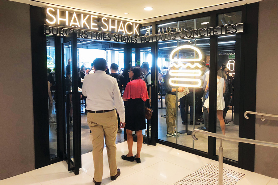
Shake Shack
“The food items list is cantilevered over the entry space in the form of an I-beam sculpture – or, more specifically, the ‘menu as the building,” says Wines. “The perforated zinc façade material is intended to reflect the colour and rib-like surfaces of the Flatiron Building.” These elements have been carried over to all the Shacks. A significant level of design finesse and thought has gone into the design of the built environment and branding of Shake Shack and the rewards are evident, with queues lining out both entries at the IFC Mall location.
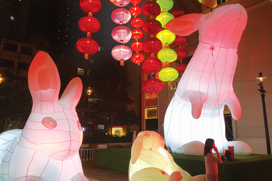
Hong Kong comes into its own as the sun sets and, down at street level, the hustle and bustle of Wanchai provides a rich layer of noise and activity. We stumbled across Lee Tung Avenue, a new 200 metre tree-lined walkway established by the Urban Renewal Authority to promote and facilitate the regeneration of the older urban areas of Hong Kong. Formerly known as Wedding Card Street by the locals, the street is now flanked by sidewalk cafés, fashion houses and lifestyle brands. During our visit, we witnessed the Moon Rabbit Lumiere as part of the mid-autumn festival. Ten giant inflatable rabbits have been installed by renowned Australian artist Amanda Parer of Parer Studio and are on a global journey across 80 cities. For Parer, the installations aim to explore the natural world, its fragility and the role of humanity within it. The audience is enticed by the play of scale, light, dark, drama and sometimes humour.
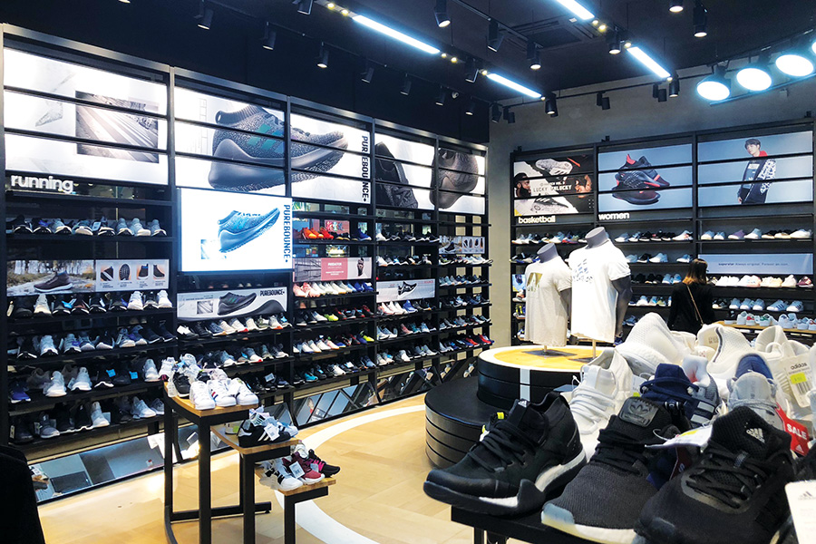
The adidas store on Johnston Road
A little further on we found the adidas store on Johnston Road, one of more than 30 stores if you include direct outlets and Stella McCartney. The adidas brand evokes youthful urban appeal with its hallmark blend of high-performance technical design and playfulness. Sports brands are big business and the store fit-outs reflect this status. A pair of Chanel x adidas Pharrell NMD Hu Race Trail sneakers will set you back more than US$11,135. That’s more than a second-hand BMW. Adidas is ramping up its experiential retail game through its move into streetwear designs.
The stores themselves feature concrete walls, urban street art and plenty of celebrity endorsement. The NYC adidas flagship recently designed by Gensler celebrates creativity and sport using a new stadium retail concept complete with a tunnel entrance, stands for live game viewing on big screens, locker rooms and track and field areas for product testing. It’s the detail that makes the design.
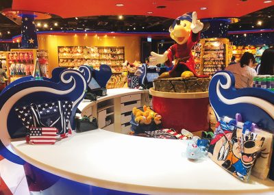
The last stop was the Hong Kong International Airport, where the retail offering takes on a more immersive experience. Shilla Duty Free is Korea’s leading travel retailer and represents some 500 fashion and beauty brands. It has recently opened the new retail Beauty&You precinct at Hong Kong International Airport designed by UK retail specialists GP Studios and implemented by brand implementation specialist Diadem.
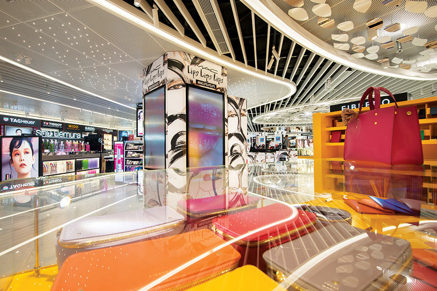
Shilla Duty Free – Beauty&You store
HKIA is ranked as one of the top ten busiest airports in the world with more than 72 million passengers passing through. The Beauty&You stores offer curated hospitality with high-end product offerings. The design detailing was based on human-product interaction, with professional beauty and fashion advisors working alongside technology providers. Digital elements include 50 storefront screens and digital columns alongside VR headsets and some 300 display counters.
Business guru Tom Peters states design should be on the agenda of every meeting, across every department, in every business. There is no question that design adds value. Good design creates competitive advantage. Great design can make the competition irrelevant.
Disney store, Hong Kong Airport


