Good signage? Good graphics? Smart icons? All could be a thing of the past. ‘Wayfinding’ and navigation are now whole new ball games and are set to revolutionise the way we get around our centres, get to them, shop them, and leave them. This is a great article on future trends and makes compelling reading.
Late American designer Massimo Vignelli (1931-2014) said, “Design is totally integrated into our daily lives. Everything we see, that surrounds us, has been designed by somebody, says Vignelli, and most of it badly.”
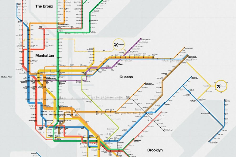
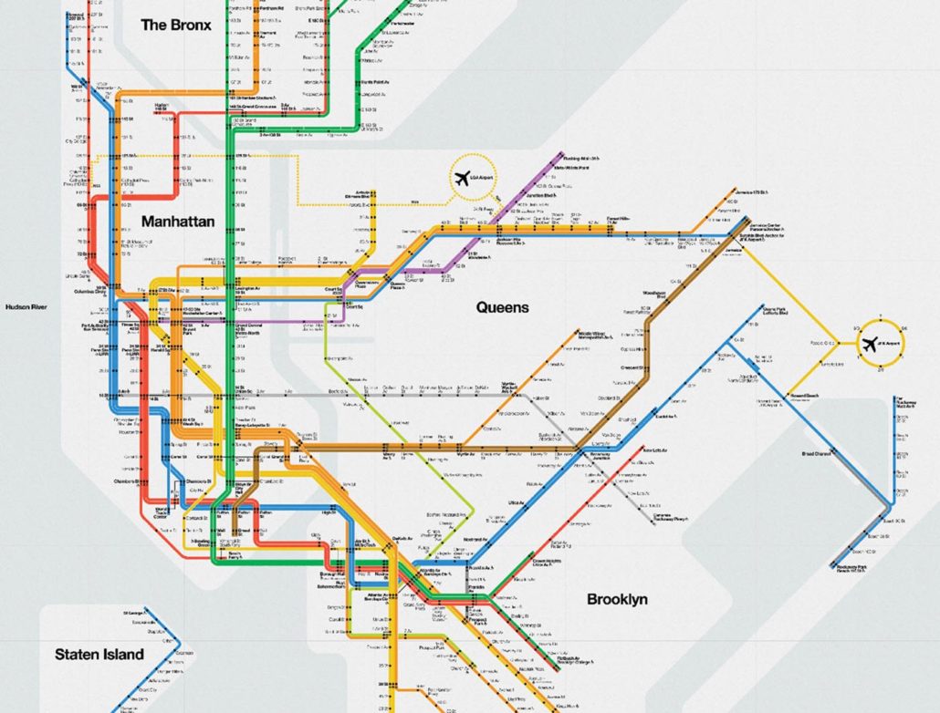
I had the good fortune of meeting both Massimo and Lella Vignelli in their NYC offices in the mid 1980s and was inspired by the clarity and simplicity of the designs for the New York subway mapping and navigation system designed in the late ’70s. Today the design solution is as relevant and accessible as it was 40 years ago. Good design is judged through its longevity and ability to solve problems in the future, not just the present.
Designing a good system of navigation for the built environment can be a demanding and complex process. But where do you start?
 Simply put, navigation is the process of monitoring and controlling movement from one place to another. In a broader sense navigation refers to a skill or study that determines position and direction.
Written records reveal the first recorded practice of navigation back in the 8th and 7th centuries BCE when celestial navigation was used by ancient Greeks to help mariners find their way as part of an epic voyage for exploration or trade.
In some respects navigating a complex space such as a sprawling shopping centre, university campus, airport terminal or multi-level car park is akin to undertaking an epic voyage. The task can sometimes be daunting, with many challenges and obstacles.
The contemporary term ‘wayfinding’, first defined by Kevin Lynch in his 1960 book The Image of the City, is recorded as “the consistent use and organisation of definite sensory cues from the external environment.” Per Mollerup in his 2013 book Wayshowing>Wayfinding goes on to define good wayfinding as being user led. Successful wayfinding is a result of knowing where you are now, where you are going, and the ability to find the right information to get to the next decision point.
Providing shopping centre visitors with good navigation tools and wayfinding principles is an important element in enhancing the user experience.
In my previous article for SCN entitled ‘Car Parks: the new front door’, the provision of clear, smart and user-friendly systems of navigation is a pathway to building customer loyalty and advocacy. Enhancing the UX makes for happy visitors, and grows your business. Today’s navigation and wayfinding is more about following a ‘blue dot’ than tracking a celestial body. So, where does all this lead us in terms of creating and implementing great navigational tools and systems of wayfinding, and how does technology fit into the equation?
With a varied demographic frequenting a typical retail environment, it is important to develop solutions that combine both traditional and digital means. Another key aspect is to address the entire user journey that begins off-site and includes some form of transportation to and from the centre, be that private or public transport, cycling or pedestrian access. The principles of universal design to cater for equitable use throughout a shopping centre is also a key design input.
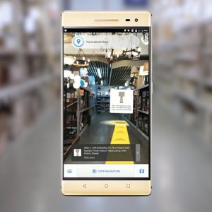
An aspect of spatial navigation receiving a lot of attention at the moment is that of indoor location positioning. Google has recently announced it is working on a service to offer detailed indoor positioning using its Tango 3D enabling software. Working with Google Maps, the feature is like a GPS for indoors.
Instead of talking to satellites for external navigation, the Tango application uses cameras to triangulate positing using distinct features of an interior space. Google’s name for the technology is VPS or visual positioning service. Imagine a shopper trying to find a particular item in a store. The future of the technology is that, using your smartphone, you can be guided to that exact screwdriver on a shelf. Further out, Google sees a future when the technology can be coupled with an audio-based interface to assist people with visual impairment.
In another technological leap forward, French retail giant Carrefour is using an innovative indoor positioning system to transform the shopping experience in its Euralille Mall hypermarket based in Lille, France.
Working with Philips Lighting, Carrefour has installed a connected Philips lighting system with indoor positioning.
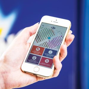
The system allows customers to find products on promotion throughout the store using a specially designed smartphone app. After downloading an app designed by Carrefour and selecting promotions from a catalogue, a shopper can orientate himself or herself with a map and start navigating to the list of selected items. The Philips technology is a patented version of visible light communications (VLC), a technology that transmits a unique code that can be detected by a smartphone camera but is invisible to the human eye. The result is hyper accurate positioning without additional infrastructure.
- MazeMap’s interactive mapping system is searchable, linkable and dynamic
Another system of indoor mapping for large complex spaces that is tackling many of these issues is MazeMap out of Norway. MazeMap is an interactive indoor mapping system that is searchable, linkable and dynamic. User journeys and pathways are accessed via a centre’s own app, website and hand-held devices. Users follow the ‘blue dot’ to a destination inside the environment. With indoor paths people can get suggestions for how to get to a destination from the outside or even between buildings. The system can show you which entrance to take, which stair, escalators or elevators to use. For those with restricted mobility the system provides alternative routes based on accessibility information avoiding stairs, narrow doorways and other areas with limited access.
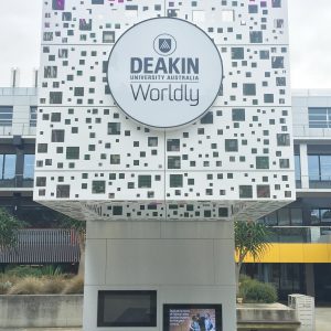
- Deakin University’s ‘Smart Campus’initiative
- Point Signs dynamic messaging
Another example of leadership in the field of built environment navigation is Deakin University’s ‘Smart Campus’ initiative that is identifying the need to transition to a unified digital signage environment. This transition involves the development of online maps, university specific apps for navigation and screen-based physical hardware. The overarching objective for Deakin is to provide a single information system with a consistent approach to process and information delivery across physical spaces.
An important learning point for Deakin is that not only do design conventions and principles need to be identified and resolved, but ongoing management considerations such as content creation, ownership and scheduling need both processes and ongoing stakeholder input for the system to be usable and helpful.
Smart signage systems using social media are also being developed and trialled in America. Points Signs, based in NYC, provides a dynamic messaging and directional system that responds to data from social media feeds such as Twitter. Data feeding into the system can reflect information needs based on the time of day. For example, late-night dining, cinema and entertainment precincts can ‘attract’ visitors through social media interaction. The information content and directions reflect user demand and real time needs.
Tap, swipe and scan technology using QR codes and NFC technology have been around for a while now and offer shopping centres a great platform for marketing products or specific retailer offers, as well as provide smarter payment systems.
The consumer affairs editor for the UK Telegraph, Katie Morley has written that by 2021 over 25% of retailers in the UK are planning to do away with queuing altogether within four years by enabling customers to use their smartphones. Transactions at traditional manned point-of-sale checkouts are in free fall, with the proportion falling from 71% in 2012 to 52% in 2017.
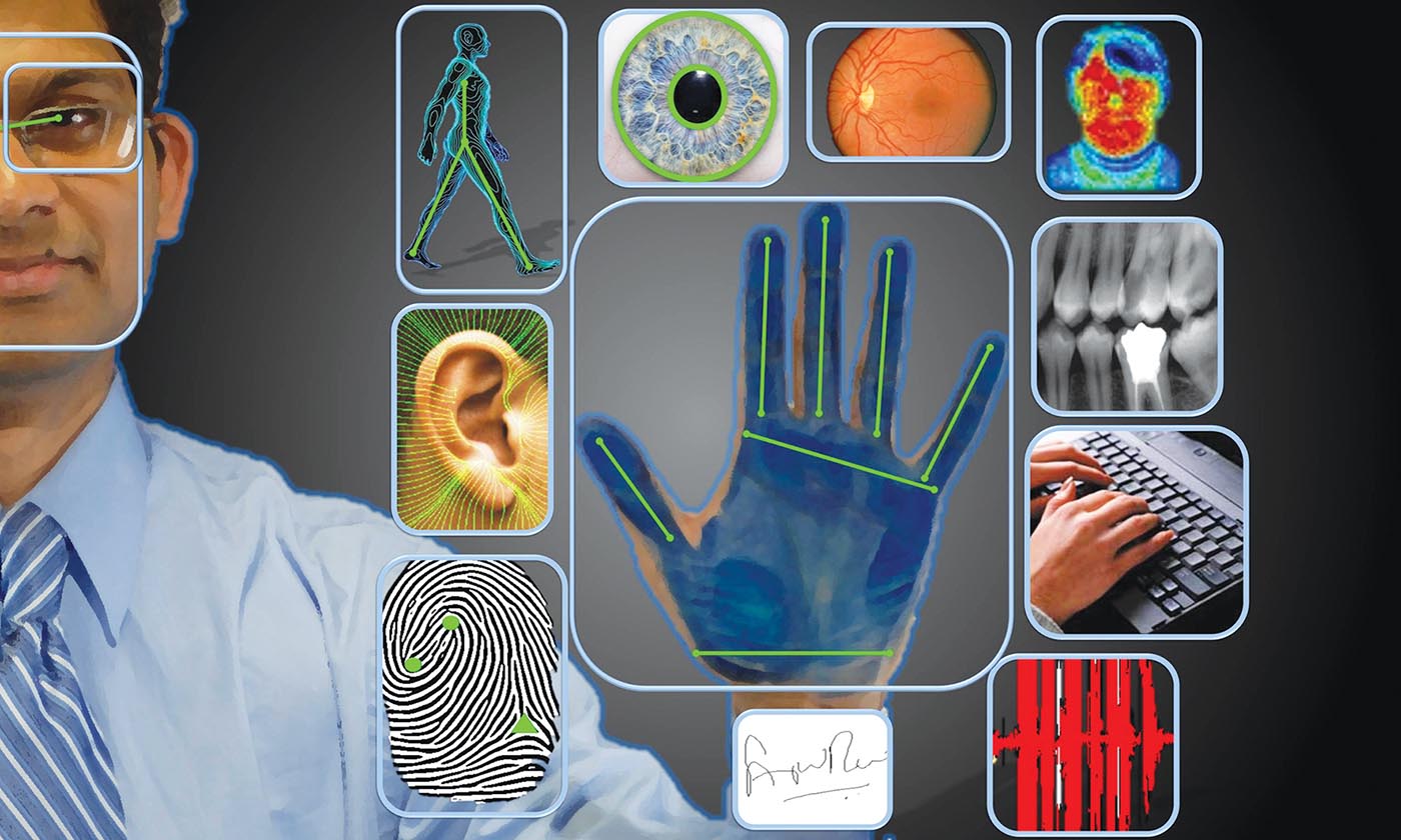
Taking this concept even further, 7-Eleven has recently established a store concept in South Korea that uses palm-reading (bio-Pay) technology called ‘HandPay’ to simplify purchasing without the use of cards or staff. No cash, no phone and no card. Biometric authentication methods identify customers through palm scans that have a secondary benefit of ensuring underage customers can’t purchase items like tobacco or alcohol.
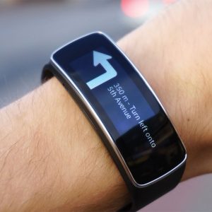
The use of biometric data to facilitate personal navigation may not be as far away as we think.
- The use of biometric data to facilitate personal navigation may not be as far away as we think.
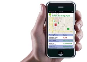
And lastly, we have all seen the advancements in parking systems with ‘Find Your Car’ technology, camera-based parking guidance systems and diagnostic software platforms with downloadable data to help owners and operators maximise the performance of their assets at both macro and granular levels. There are also a number of car park apps available (like parkbud.com or ParkMe) to not only help you locate your vehicle but also find a car park, save your location, track time, and provide a full locality guide of what’s on around you as well as provide an online payment system.
When it’s all said and done, good navigation and wayfinding needs to be user friendly and provide information at the right time to help people find their way. In the age of smart devices and digital content, it is possible to equip users with information across their entire journey (pre-journey, en-route and on-site) so they are pre-aware, less frustrated and better informed. This will inevitably lead to more dwell time, a relaxed persona and more enjoyment of the environment.
- ‘Find Your Car’ technology


