Need to refurb a mall? Thinking about some pink marble, new ceilings, slick downlights? Think again. Iain Stewart wants us to consider featuring the structure instead of hiding it. He wants us to get rid of all the clutter, to create a bare ‘theatre’; a stage on which the retail can perform!
This article sets out to sketch a possible future for shopping environments that is informed by theatre production – specifically modern theatre’s appropriation of space to conjure emotion with minimal ends.
The high school I attended built a new theatre on a shoestring. Beneath the hallowed school hall was a lower-ground-level basement used for the school’s bicycle store. A fenced enclosure with roof and bike racks was erected elsewhere on the grounds and the bicycles were relocated, leaving the basement free to be appropriated for our school theatre. The walls and concrete soffit – the base shell – were painted out midnight blue to disappear. A wall for wings and backstage (a two-metre passage crammed with props) is all that was needed spatially for the theatre to function. Timber boxes were nailed together for the tiered seating of a small audience, there was no stage as such, and the action took place on the polished concrete floor, its emptiness a field for endless possibility. Sometimes these timber boxes, stacked, served as stage props for a production: a chapel in ‘Child’s Play’. An easel became a horse in ‘Equus’, the headmaster’s lectern, robbed from the hall upstairs, was everything needed to create the courthouse for ‘The Crucible’ – the rest was light and sound.
Suspended above the floor was a grid of theatre spotlights operated from a window cut into the wall at high level – elevated geeks turned gods – and the requirement for aspiring actors was to find the light. The pool of shadow was a backdrop for extemporising and innovation, and light coloured the play – like a Dutch renaissance painting, the dark canvas was illuminated to bring vivacity to its subject.
- Equus
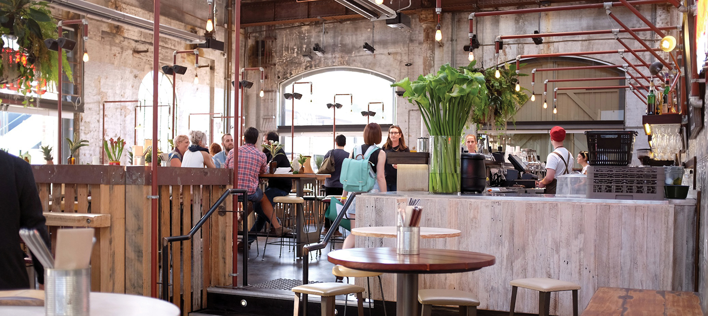
- Carriageworks
This strategy – of stripping back to the authentic base vessel in order to accommodate a changeable programme – seems well suited to the dilemma ‘retail’ poses for architecture. Architecture, with a capital A, is, historically, a study in substance and monumental permanence (firmitas, utilitas, venustas, veritas, etc) but, without a strategy, finds itself at sea when confronted with the changeable fashions of shopping.
However architects are good at designing for flexibility, and our theatres and museums are evidence of this. The lessons of the museum – its requirement for temporary travelling exhibitions and the housing of growing collections – are as applicable as those of contemporary theatre to the transforming of shopping environments.
The virgin white bulkheads of our architectural renders (Le Corbusier’s “masterly, correct and magnificent play of masses brought together in light”) quickly become blighted by misaligned detritus: smoke alarm, sprinkler cover, linear slot diffuser, illuminated statutory egress signs. In defence these are sometimes late and unpredictable intrusions: security paraphernalia, wi-fi back-bone panel, Xmas light fixings and the rest. Worst offender is the ubiquitous downlight and cove-concealed fluorescent tube which both flatten all sensory experience in a homogenous, disorienting glare – “Junkspace… the product of an encounter between escalator and air-conditioning conceived in an incubator of Sheetrock.”
To reinvent: first the canvas – a return to authenticity. Layers of accreted ornament and plasterboard are scraped off like too much icing on a cake, the ingredients of ‘junk-space’ purged to reveal the building’s humble original shell, soffit, concrete columns and walls. Next the floor: all the pink, polished, attention-seeking marble of past affectation is ripped up and replaced with a neutral, matte grey stone as a permanent backdrop. When we shatter superfluous plasterboard, an entanglement of carelessness is revealed. Indifferent cables and haphazard flexi-duct is stashed, like contraband, ‘out of sight and out of mind’. “They’ll never see it,” he said.
With ornamentation summarily demolished, we get to the serious work of tidying up and asserting quality. An exposed soffit and services forces coordination and it’s now a collaborative play. The whole consultant team is engaged in the aesthetic act: their roles, previously silent, are given lines that now get to be heard, with their actions on display in support of a coordinated performance. Nothing is more inspiring and hopeful for architecture than a conversation with the fire services contractor about the aesthetic potential of the sprinkler heads he’s drawing! Or about why the pipework needs to be ‘almost’ black, and the sprinkler heads brass.
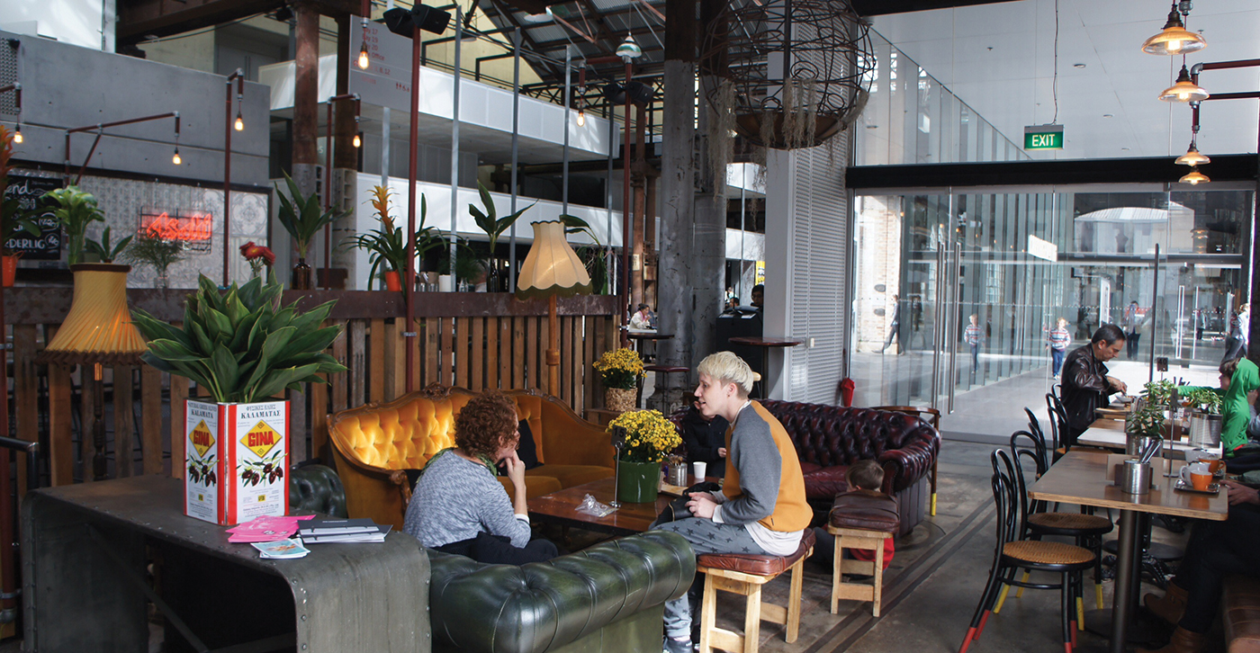
- Carriageworks
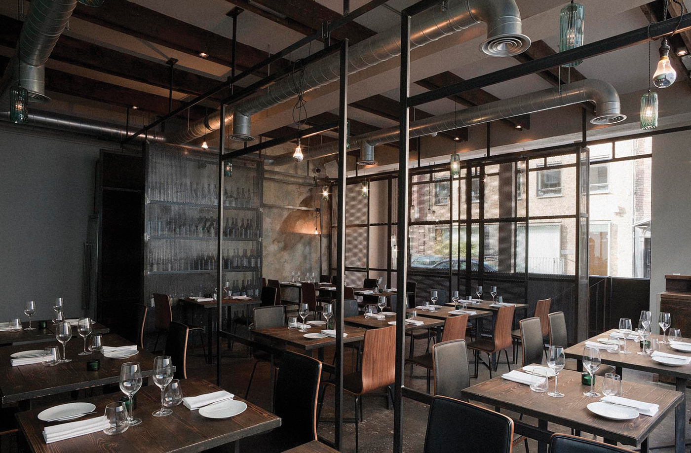
The space is now coloured with purpose – a warm, matte metal reflects indirect light; acoustic panels are suspended only where they’re needed; to comply with health regulations, an impervious ceiling drops down just where the kitchens are; gaps are left between these objects and the soffit painted out ‘almost’ black to create a lofty void (and hide future dust). The space can’t believe the sudden increase in play it’s been given by the removal of an oppressive ceiling, which allows the shopfronts height and display. The mechanical engineer provides matte black diffusers neatly aligned to a coordinating grid, and the matte black duct work recedes into the shadows like a black-uniformed stage hand. Black light fittings, like theatre lights, illuminate, with clear design intent, the colours of the protagonists: a screen, a table top, a bench – using minimal ends every item visible is put to use. And where daylight now falls it appears appreciably pure and of itself; previously its impact would have been lost in an engineered, fluorescent and monochromatic ‘lux level solution’. Instead the lighting designer is granted a leading role and with the architect works to ensure each necessary object in the drama
‘finds the light’.
When blind-sided by the wi-fi back-bone gadget that no-one foresaw to take cognisance of, there’s a framework in place for improvising – you ask for it to come in black and have them ‘disappear’ it into any one of a number of gaps which are going to work for them. Happily you learn that fire-exit signs come in black for use in movie theatres – now they too can be brought into play. Like the costumes of players on stage, or artwork in a gallery, or an artefact in a museum, art is now given a framework within which it can be perceived and appreciated instead of the distraction it might otherwise be in the noise of a more traditional retail space.
Daniel Herman’s ‘The Harvard Design School Guide to Shopping’ warns of the ‘theatre of bombardment’ or bewilderment through amplification and entertainment. Where ‘architectural matter’ is thrown at the shopper to achieve a continual interruption of their attention ‘akin to the operation of the fun house… vertiginous and claustrophobic subjugation, dislocation and disorientation’. This is not the strategy referred to here. Contemporary theatre is all about achieving more and using less, about galvanising the imagination of the audience and allowing them to fill the gaps. The performance is participatory, intimate and engaging – the suspension of disbelief to touch the real. The approach outlined here suggests a strategy for shopping’s reclamation of Architecture (capital A).
- Carriageworks


