Iain Stewart looks at the design philosophy behind the Level 2 redevelopment of Broadway Sydney, profiled in our last issue. It was all about creating an ‘urban environment’ within a centre. This article outlines the process of providing design solutions for the redevelopment of the Broadway Sydney dining precinct.
Broadway Sydney is situated in the heart of the inner-city Sydney suburb of Ultimo and is surrounded by a mix of low-, medium- and high-density residential and commercial office space. It is located within walking distance of two major universities and is a stone’s throw from the CBD. Yet it feels like your typical enclosed suburban centre (albeit organised vertically over five levels).
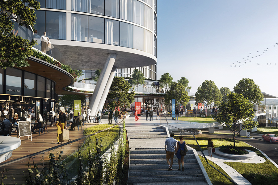
The overarching masterplan aspiration is to transition Broadway into a premier urban destination, and the Level Two dining precinct redevelopment forms the first part of this strategy. An urban destination should be a context-appropriate, vibrant place. It should extend and connect to existing fabric, harbour complexity, be a catalyst for change and future growth and grow an enduring identity.
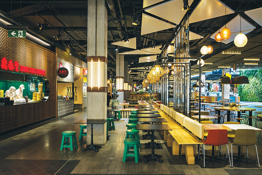
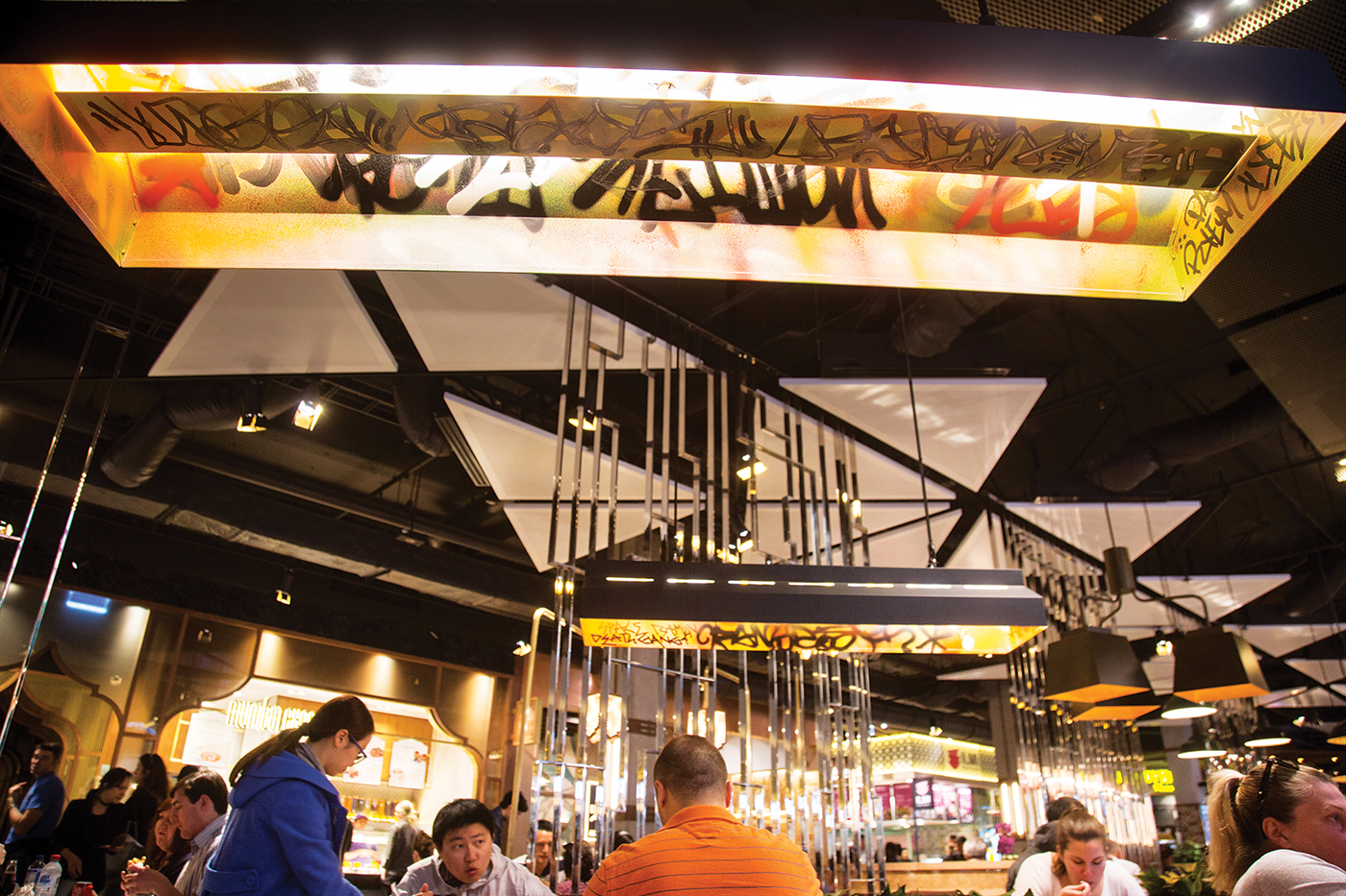
Broadway Sydney’s Level 2 food court
Broadway Sydney is characterised by a strong convenience-based offer and is very well patronised – having the highest sales per square metre in Australia – but the visit duration is generally short, an all too brief in-and-out. The masterplan intent is to extend dwell time at the centre into the evenings and, to this end, the idea of a ‘food court’ in its traditional sense has been scrapped. Replacing it is a dining precinct and mixed-use social space with a programme of quick-service restaurants, slower food experiences and fashion specialties, anchored by international powerhouses H&M and Sephora. Licensed seating areas offering more comfortable seating arrangements encourage patrons to linger for longer periods. This fusion of fashion and food creates a more layered, complete, urban shopping experience and to ensure continued use of the space between mealtimes.
The concept builds on the existing food experience and character of Glebe Point Road, and positions Broadway Sydney as a foodie destination for the local community. The concept seeks to create a new social hub that anticipates future development beyond the shopping centre. The concept for the place is an ‘urban room’ and meeting place catering to city dwellers and celebrating city life.
In summary, the challenge identified in the brief was to evolve Broadway Sydney from a suburban centre to an urban destination, the proposition of ‘how does fashion and food add to this evolution?’, and the strategy adopted towards arriving at a design solution: to develop a glossary towards an urban room, to ask of every spatial decision or material choice ‘so, what makes this urban?’.
- Broadway Sydney dining precinct
The project’s aspirations were to develop a high-quality food destination with a vibrant social space, improve connectivity and strengthen Broadway Sydney’s identity. Towards realising these goals, fashion, food and entertainment quotients of the brief would need to be reconciled within a single space and the design would need to appeal to an inner west demographic as well as attracting new markets. The centre’s predominantly cosmopolitan demographic comprises of young professionals, young couples and tertiary education providers and students.
We envisaged a day-and-night environment that has a dynamic synergy between food, fashion and cinema that complements Glebe Point Road activity. In strengthening Broadway Sydney’s identity we sought to build on existing context – the character rich, authentic high street – to arrive at a lasting aesthetic of ‘urban with a touch of gloss’ as project maxim, to encapsulate this objective and appeal to the core demographic.
- Broadway Sydney dining precinct
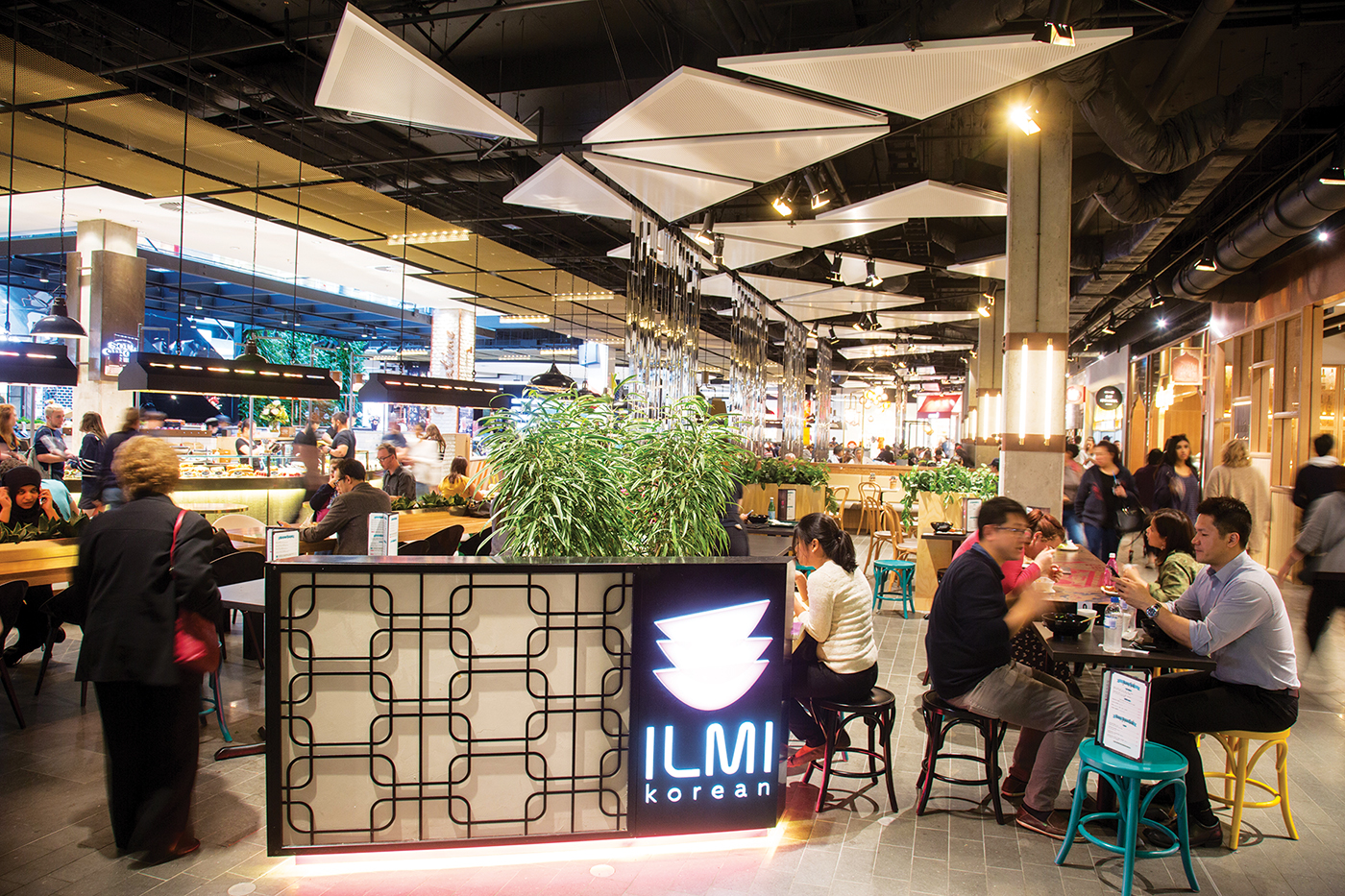
The design aims to amalgamate existing elements to form the new food destination. The challenge is to reconcile seemingly different spaces within a central social space. The transition between smaller spaces within the larger space is realised through a layering of finishes and experiences. The space was modulated across its width to transition appropriately between differing functions – to permit the coexistence of fashion and food. Three distinct zones were articulated using floor finish textures, feature ceiling types and materials, screening elements and ‘island’ kiosks.
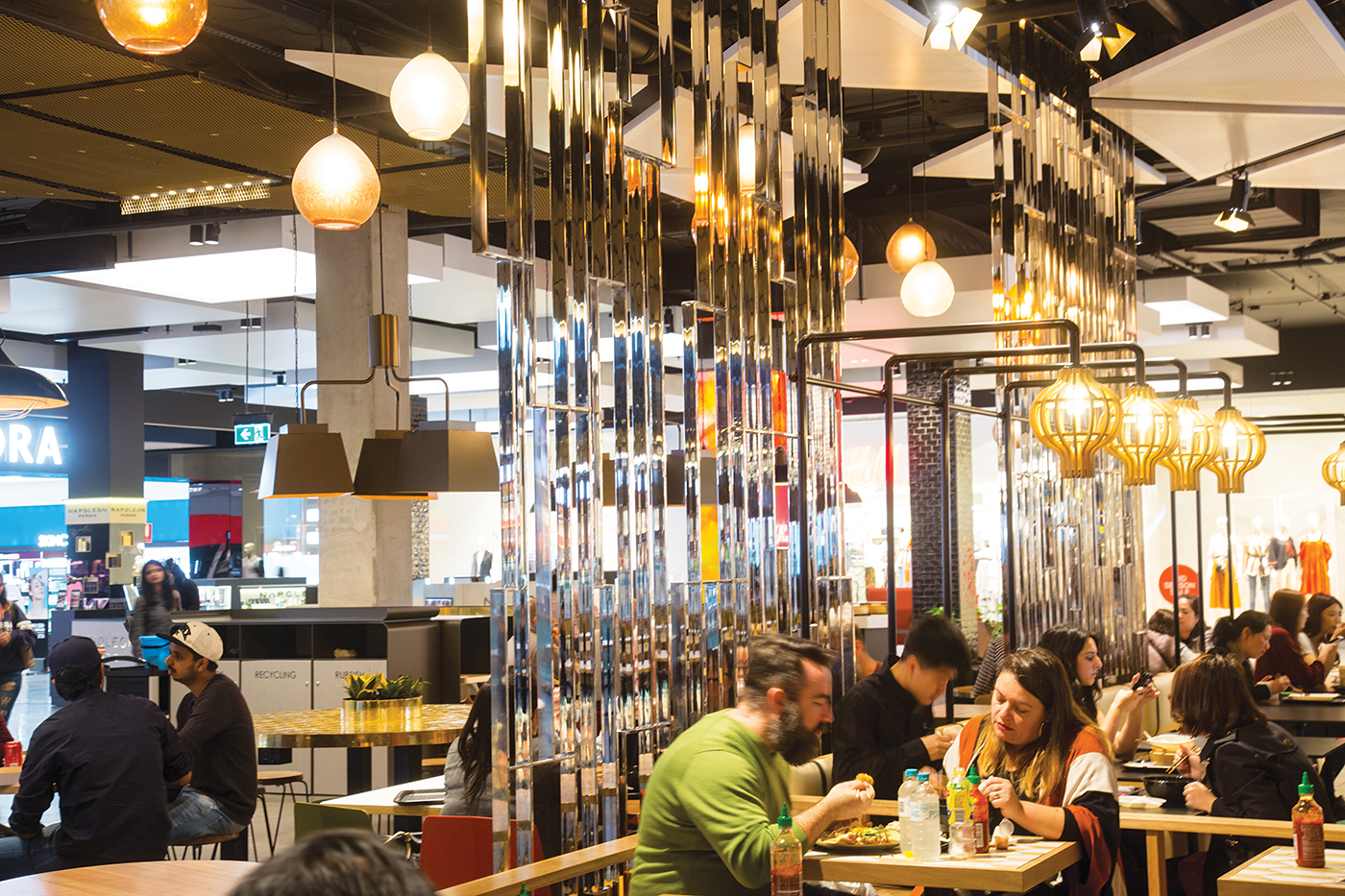
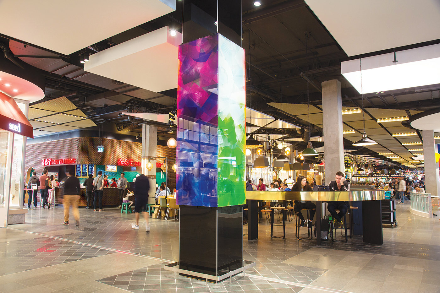
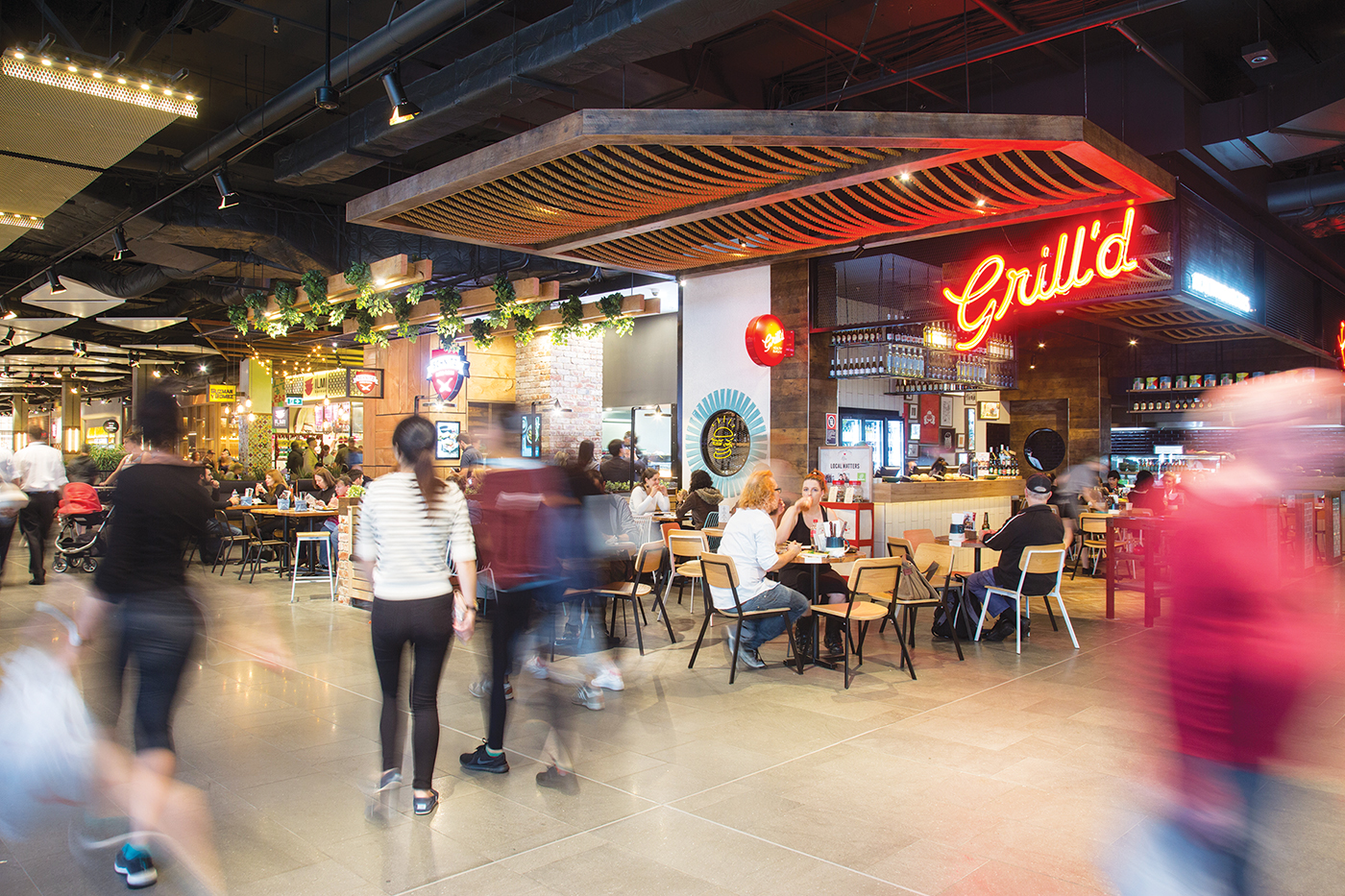
An ‘Eat Street Laneway’ is defined by a tighter floor finish module, screens that frame a more intimate scale, blade signage for a laneway character and raw finishes – columns stripped to a bare finish, sanded and sealed, and the soffit painted charcoal with services exposed. The ‘Urban Room’ is designed for multiplicity of use with loose furniture and fewer bounding elements. It is defined by a grid of gold anodised expanded metal sheets, and hosts a variety of seating scenarios to accommodate differently sized groups. ‘Fashion Street’ is articulated with fabric ceiling boxes illuminated by LEDs within (the LED colour is changeable for special events), comfy furniture lines the ‘street’ and provides a place to dwell, and columns are finished with glossy black subway tiles.
- Broadway Sydney dining precinct
- Broadway Sydney dining precinct
The appearance of activity needed to be created through a layering of finishes and programme. Spaces are inviting and contrasted for diversity of use through a gradation from open to semi-enclosed space; defensible and intimate pockets of space for seating are coloured with warmer, darker hues, and subdued lighting is focused on table tops to rest the eyes and bring all senses to the fore. The light fittings themselves are sculptural and have colour and personality. Void space is leveraged to attract a social use – light fittings, temporary promotion and installation art pieces are suspended within void spaces to celebrate height, make visual connections and encourage movement between levels. The existing building was stripped back to its base – plasterboard accretions were removed and concrete was exposed. A neutral enduring stone (basaltite) was selected for the floor finish as a permanent backdrop, the soffit and services were painted dark charcoal so as to disappear.
Like modern theatre, ‘stage sets’ in the form of suspended ceiling elements, art and furniture installations colour the space; and solve programme requirements such as lighting and acoustics, food prep bulkheads and ventilation. Furniture, lighting and tenancy items thus provide bursts of colour against a discreet palette – art and culture are celebrated through the setting aside of sites for intervention by invited artists – denoted with an engraved stainless steel plaque.
These installations serve to forge a connection with the community and engender relatedness and ownership. The space has been built to be lively before it is inhabited – which makes it inviting even for those that are first to arrive.


