Tony Quinn likes drama, in the form of huge architectural statements and what he calls ‘the wow factor’! He’s picked out a few recently completed ones – in Guangzhou and Shanghai, China; Mexico; Bangkok; Leeds, UK and Stuttgart, Germany. It’s pretty flashy retail!
Once again, I have scoured the globe to find the latest and greatest (in my humble opinion) of recent developments that contain the ‘wow factor’.
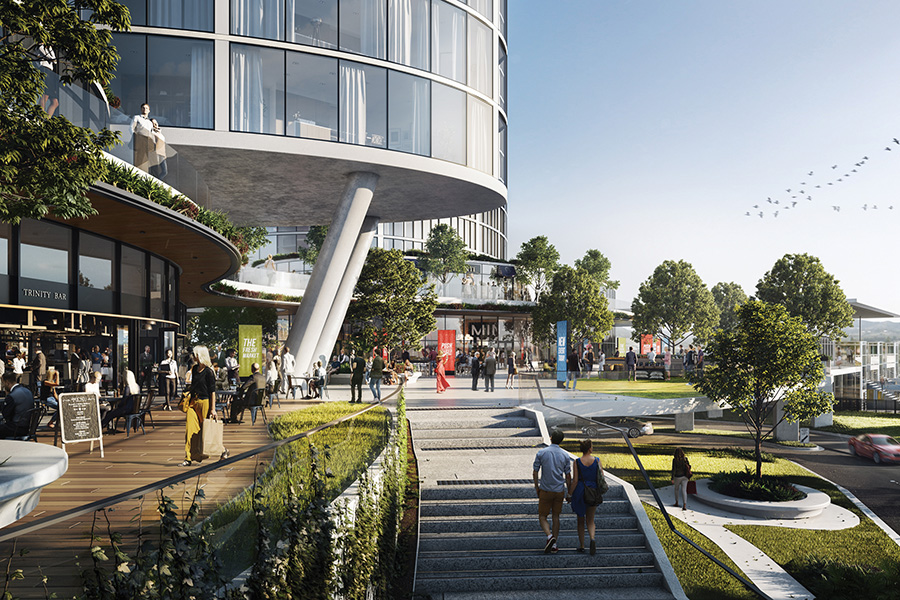
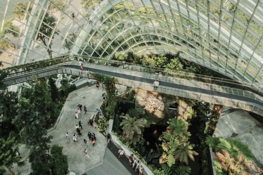
The first was Parc Central in Guangzhou, China opened less than 12 months ago and described as an urban park retail development.
- Parc Central Guangzhou, China
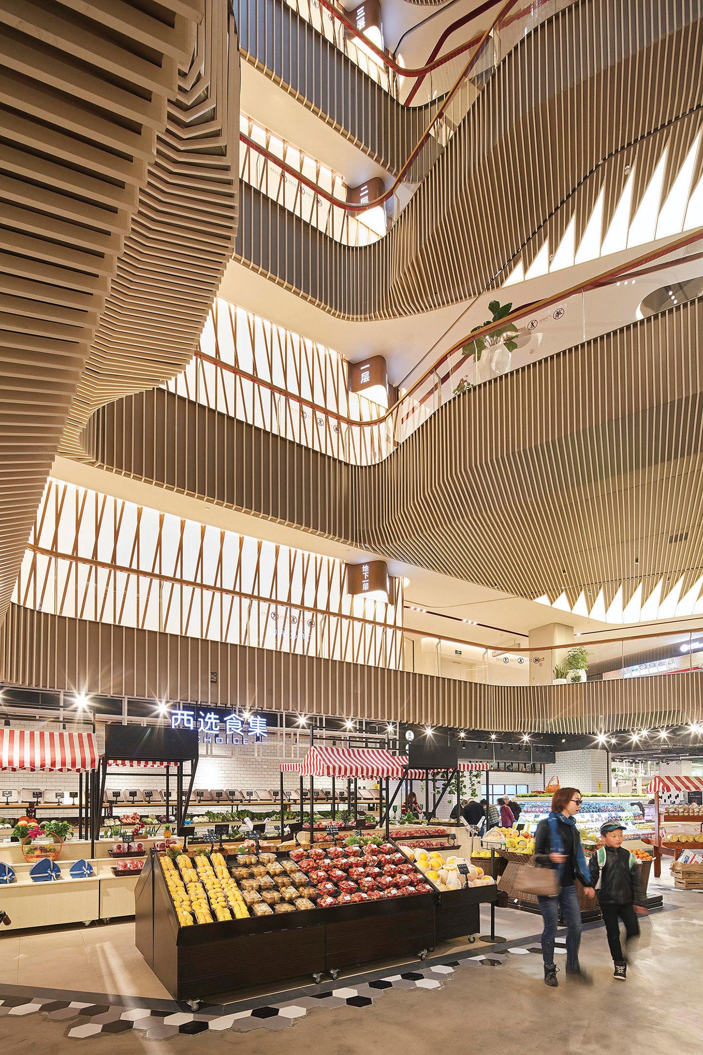
The development is set in the heart of the city’s new central business district along one of the major thoroughfares and combines retail, transit-oriented, and public realm design strategies.
The result is a distinctive 110,000m2 development with the landscape forming its heart with two levels above ground and three levels underground.
- Parque Toreo, north of Mexico City
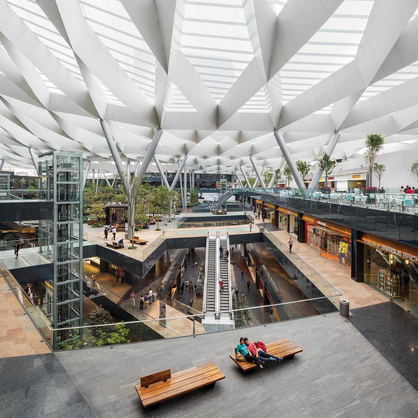
The next is a mixed-use development Parque Toreo located north of Mexico City, also completed towards the end of 2016, and it too was conceived as an urban park. The development contains a shopping centre, hotel and three office buildings covering 440,580m2 of built area. The retail occupies the first four floors with shops, cinemas and restaurants with a central zone of trees, fountains and public space. The project includes a 220-room hotel over 15 floors, six levels of underground parking and the three office towers of 120,000m2 of total commercial space.
The striking tree-like roof form over the retail pulls light down to its lower levels.
- Lane 189, Shanghai
- Lane 189, Shanghai
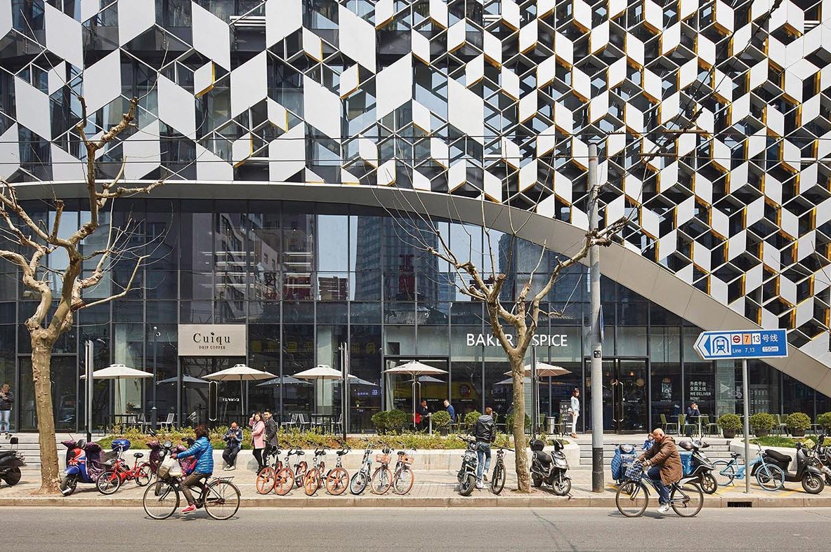
China appears to be ripe ground for architects having limitless fun, and in Shanghai another development named Lane 189 opened in late 2016 combining retail, restaurants and office space to provide a lifestyle destination for Shanghai’s young professionals. The design incorporates elements of the old Shanghai through its use of geometry, pattern and materiality.
The qualities of the neighbourhood are reflected in the building by vertically stacking the envelope. Inside elements of street life are mixed with lifestyle retail which encourages visitors to stroll through and up the different levels of the centre. The façade’s hexagonal skin is multilayered enabling views to and from the building. Typical of a lot of retail in Asia, it extends over multiple levels topped by a roof terrace some seven levels up, encompassing 38,800m2 of space. It certainly creates a striking and eye-catching termination of several street vistas, especially alongside its conservative neighbours.
- Victoria Gate Centre, Leeds
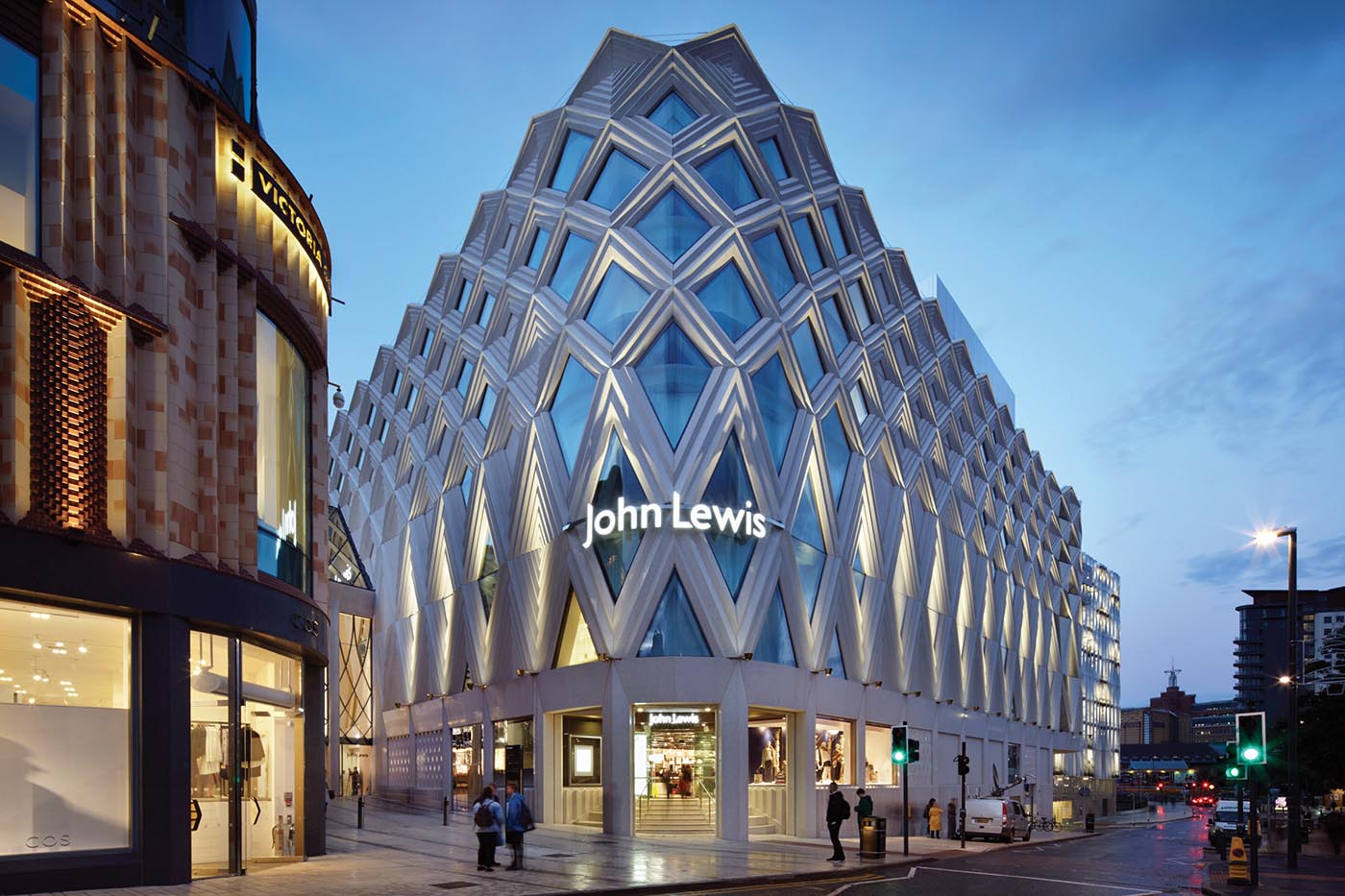
Onto the UK and Victoria Gate Centre in Leeds, which was crowned ‘Best in the World’ at the prestigious MIPIM Awards ceremony in March this year in France, and was also named building of the year in the RIBA 2017 awards. The brief from the developer Hammerson was to design a new vibrant, key urban block in Leeds city centre which provided retail and leisure anchored by a department store (John Lewis). The visibility and identity of the John Lewis store was an important part of the brief.
The masterplan was to be part of an extension of the Headrow, Leeds’ main civic axis, and the client brief emphasised it should not be a ‘mall’ but a 21st-century interpretation of Leeds’ famous Victorian arcades. The 26,000m2 development comprises the department store multistorey car park and dual arcades with a mixture of specialty stores, restaurants and leisure facilities. The buildings are three distinct elements with individual identities, with the John Lewis store anchoring the scheme and creating a gateway into the city centre along the Headrow Axis.
Materials draw on the history of terracotta facades in Leeds in a modern interpretative way, layered not unlike woven fabric. The car park exterior is distinctively different, clad in twisted aluminium fins, creating a diagrid pattern, varying shadows and the building’s ability to naturally ventilate.
The interior arcades are reminiscent of Victorian arcades through their stone patterned floors and curved glass roof, based on Leeds’ famed herringbone cloth.
- Glass House Sindhorn, Bangkok
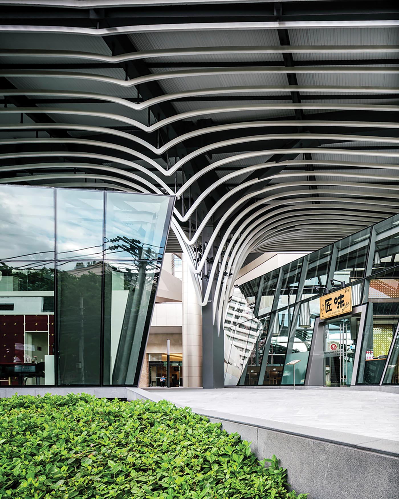
Back to Asia, to a little 1,650m2 gem in Bangkok whose brief was to reimagine an old 1980s office building on Wireless Road by having a spectacular retail building in front of it to create a new ‘front door’. The Glass House entry pavilion, as it’s called, has four restaurants with mezzanines and one small cigar bar. By splitting the four restaurants, the building is permeable providing access through to the Sindhorn office towers, and holds the street edge for the development.
The roof structure has taken its design cue from several large street trees, and bends and twists so you feel like you’re eating under the trees.
A stunning little piece that sweeps the old ’80s building into a modern contemporary world.
- Gerber, Stuttgart
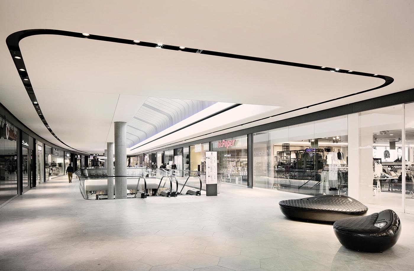
Onto Germany to a mixed-use development known as the Gerber, a 14,000m2 new urban development in Stuttgart’s city centre. A former company headquarters building was demolished to make way for the Gerber comprising retail, residential and commercial office space. The three-level centre connects to the city via three of its four corners, feeding customers through the building because of its strategic position on several crossroads.
The interior was designed with clean, simple lines to avoid visual competition with the specialty shops, with rounded ceilings, clear glazed balustrades and warm grey stone floors.
It’s a sophisticated minimalism. Lighting design features prominently throughout creating a mood of understated style. Tenancy guidelines allow signage only in shopfronts, emphasising a decluttered look down the malls to further deliver on the clean design simplicity.
It’s interesting to note the predominance now of so many mixed-use developments.


