Susanne Pini looks at the 2016 Awards for Retail Architecture and Design. She covers a wide range of projects from the Crystal Houses of Amsterdam to the House of Dior in Seoul, Samsung 837 in New York to Miu Miu Aoyama Store in Tokyo, and a lot in between!
Looking back at 2016, it’s wonderful to see the mix of the year’s award-winning retail architecture and design projects, some judged by the official industry bodies while others have been chosen by the global community of readers and contributors of well-known design blogs. However, even though the awards were given in different categories based on a range of different criteria, it could be said that both bold innovation and thoughtful renovation defined the year in retail architecture.
Crystal Houses, Amsterdam
Crystal Houses by MVRDV Architects won the highly coveted award for Shopping – Completed Buildings at the World Architecture Festival, one of the most significant global events in the architecture industry.
Crystal Houses, now home to the Chanel boutique, is located on PC Hooftstraat, a former residential street that has become Amsterdam’s hub for luxury fashion brands. While many of the buildings on this street have lost elements of their original architecture, this project offers the mix of retail and housing that combines Dutch heritage with an international sensibility.
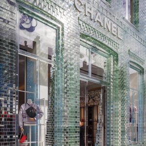
Described by the MVRDV as the first of its kind, the seemingly simple, entirely transparent façade of a high-end flagship store used a pioneering glass technology to replace the brick facade, hence recreating the city’s traditional architectural style.
- Crystal Houses, Amsterdam
- Crystal Houses, Amsterdam
After developing the concept, the architects worked with different experts to develop the technologies required to make it a reality, from leading university researchers to a team of glassmakers in Venice and a cutting-edge German engineering company. “Six to 10 experts worked every day for a whole year in a place that bore more resemblance to a laboratory than a construction site,” said MVRDV in a statement.
Crystal Houses offer the store a window surface that contemporary stores need, whilst maintaining architectural character and individuality as well as respect for the surroundings.
The architects believe the new technology offers a solution to the loss of local character in shopping areas around the world, many of which are dominated by plain glass shopfronts due to the increased globalisation of retail.
As Winy Maas from MVRDV explains, the technology “enables global brands to combine the overwhelming desire of transparency with a couleur locale, and modernity with heritage. It can thus be applied everywhere in our historic centres.”
Apple Store, Stanford
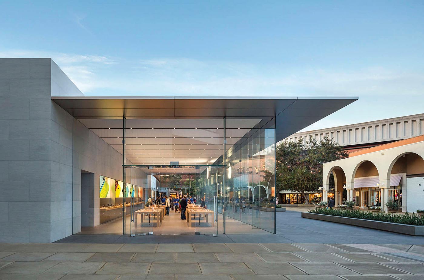
Not surprisingly, yet another Apple store won a design award, this time in the Retail category of the 2016 Architizer A+ Awards. The pavilion-like store within the largely open-air Stanford Shopping Center in the heart of Silicon Valley was designed by Apple favourite architects Bohlin Cywinski Jackson. While the design is built on Apple’s iconic glass cube shops, this broad, glass-enclosed room with a dramatically thin roof makes the retail environment feel more like a part of the outdoor plaza, and the outdoor plaza part of retail environment. According to the architects, “it is a fresh and evolutionary direction for the Apple retail programme with a design that is a re-interpretation of the favourite architectural themes developed over the past 13 years, while retaining many of the familiar elements associated with Apple Stores.”
- Apple Store, Stanford
Samsung 837, New York
In 2016, MAPIC, an international retail real estate show held annually in Cannes, France launched a ‘Best Retailtainment Concept Award’ in order to recognise the year’s most successful entertainment concept and its integration in a point of sale. Retailers and developers always look for innovative ways to attract new customers to their stores and shopping centres, and retailtainment is a new way to drive traffic by adding leisure to the retail mix.
The first-time award went to Samsung 837 located in New York’s Meatpacking District. It is described by Samsung as the ‘physical manifestation’ of the company’s brand, providing an opportunity for the public to experience Samsung technology, signature services and culture through special events. However, unlike Apple or Microsoft, this is actually not a retail store at all; not a single Samsung product displayed is available for purchase although employees will gladly help you purchase an item through one of its resellers, whether it’s Amazon or local NYC megashops. The only way to actually spend money at all in the 5100m2 store is in the trendy in-store cafe.
“People don’t need another store,” exclaims Zach Overton, General Manager of Samsung 837. “We are trying to build the flagship of the future.” The state-of-the-art building is a creative expression of Samsung’s brand and will serve as home for the ‘marketing center of excellence’.
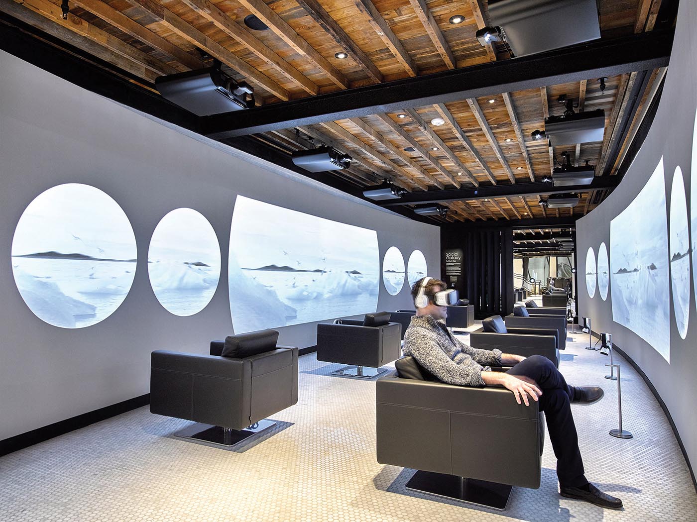
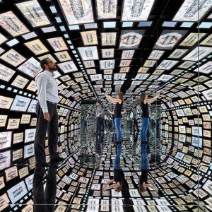
Open to the general public, Samsung 837 is the living lab and digital playground featuring numerous installations and touchpoints spread over three floors, including a one-of-a-kind digital screen, theatre seating for performances and special events, a gallery to feature curated content experiences, a broadcast studio, a Virtual Reality (VR) Tunnel and much more. On the top floor, a connected living room demonstrates how a smart home works, while a full kitchen is available for cooking demonstrations and classes.
There’s also a ‘selfie station’ where visitors can have their face beamed onto the huge screen for a few moments – enough time to Instagram it!
Partnering with its artistic neighbours in the Meatpacking District, the building will also serve as a community space.
Forget transactions – today’s consumers want interaction, or as Overton puts it, by “reimagining the traditional store experience, 837 is a fully immersive cultural centre, featuring programming which will tap into people’s passions such as art, music, entertainment, sports, wellness, culinary and fashion, all powered and enriched by technology.”
- VR Tunnel – Samsung 837, New York
- VR Tunnel‚ Samsung 837, New York
House of Dior, Seoul
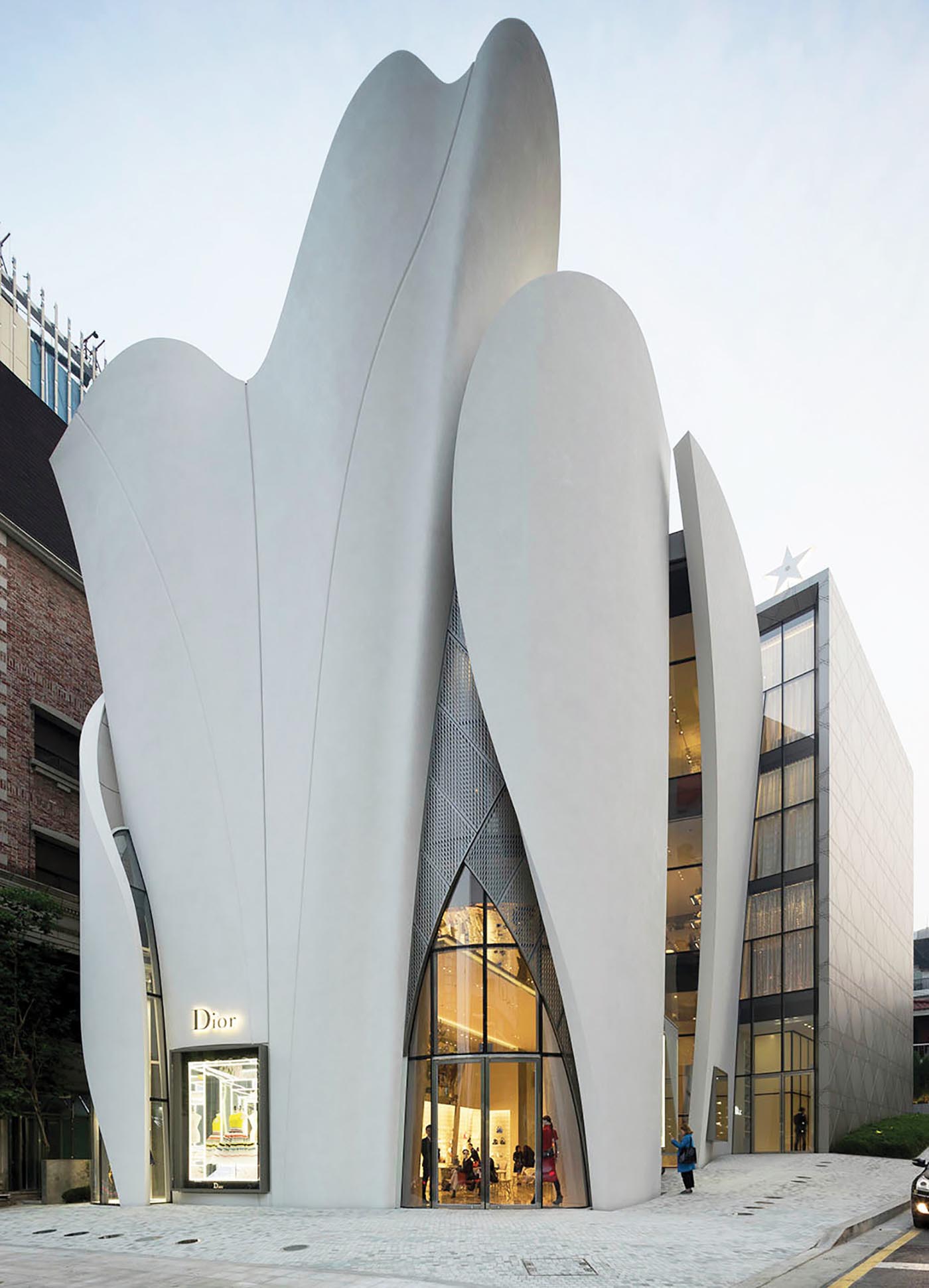
House of Dior in Seoul, designed by the Pritzker Prize-winning French architect Christian de Portzamparc, was one of the 2016 winners at the International Architecture Awards by The Chicago Athenaeum: Museum of Architecture and Design and The European Centre for Architecture Art Design and Urban Studies – billed as ‘the largest and most extensive global architecture awards program in the world’.
Nestled in the heart of Seoul’s chic Gangnam district, the six-storey building houses Dior’s accessories, fine jewellery, watches and clothing as well as a VIP lounge, art gallery and Cafe Dior operated by the celebrity chef Pierre Hermé. The architects wanted the building to reflect Dior’s work in every aspect. The voluminous folds of its bright white façade, taking the form of twelve soaring resin and fiberglass sails, were inspired by the fabrics, shapes and movement of the toiles created in Dior’s Haute Couture Atelier, while the building’s base itself is decorated with Dior’s cannage motif.
The innovative and unique building reflects the whole exclusive world of Dior, from its heritage of timeless elegance to its modern essences of luxury and innovation.
In Seoul, where the quadrangular buildings align with the avenue and which are all occupied by leading international fashion labels, the building stands out like a large sculptural tribute to Dior.
- House of Dior, Seoul
Miu Miu Aoyama Store, Tokyo
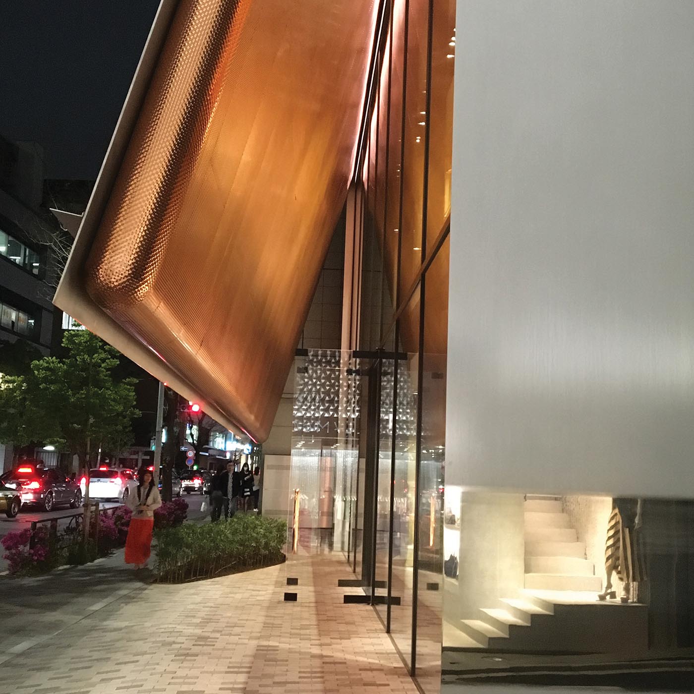
Readers of ArchDaily, the world’s most visited architecture website, voted Miu Miu Aoyama Store by Herzog & de Meuron Architects, as the Building of the Year 2016 in the Commercial Architecture category. With a footprint of just over 250m2 and local building code limiting the height to two storeys, the Miu Miu store in an elegant Aoyama neighbourhood is a simple stainless steel box-like shop with two flaps opening up the building at the front and back – a defining element for the design. This metal awning also provides shading for its interiors with the design intent to pique people’s curiosity as to what’s inside, and to contrast the simple exterior with the materially rich interiors. The store is located directly across the street from the crystalline eye-catching Prada Aoyama, its sister brand that has, over the past two decades, become a showplace of architectural invention. In contrast to the transparency of the all-glass Prada building, also designed by Herzog & de Meuron, the understated metallic surface of the Miu Miu opaque façade lends the project a very intimate quality, described affectionately by ArchDaily contributors as more understated than extravagant, more hidden than open and finally more like a home than a fashion store.
- Miu Miu Aoyama, Tokyo
Sonia Rykiel, Paris
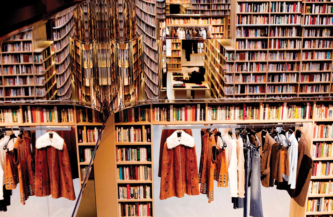
EuroShop Retail Design Award, given for the most convincing store concept worldwide in 2016, went to the Sonia Rykiel flagship store in Paris. Located in Paris’s legendary Saint-Germain-des-Prés quarter, this hybrid store by the iconic French fashion designer is a homage to the area famed in the 20th century for its many cafes and bookstores. Designed by Julie de Libran and Swedish-Portuguese artist André Saraiva, the retail space has been transformed into a library-style pop-up and features 50,000 books adorning the walls and shelves from the floor to the ceiling, holding some of the most noteworthy pieces of classic literature. While books are not for sale, the bookshelves are combined with rectangular voids filled with thoughtfully exposed handbags, shoes, accessories and clothing from the latest Rykiel’s collection, all of course available for purchase. Recently, this library-inspired, innovative shopfitting concept has also been successfully developed in the Sonia Rykiel flagship stores of New York, London and Tokyo.
- Sonya Rykiel, Paris
COEX, Seoul
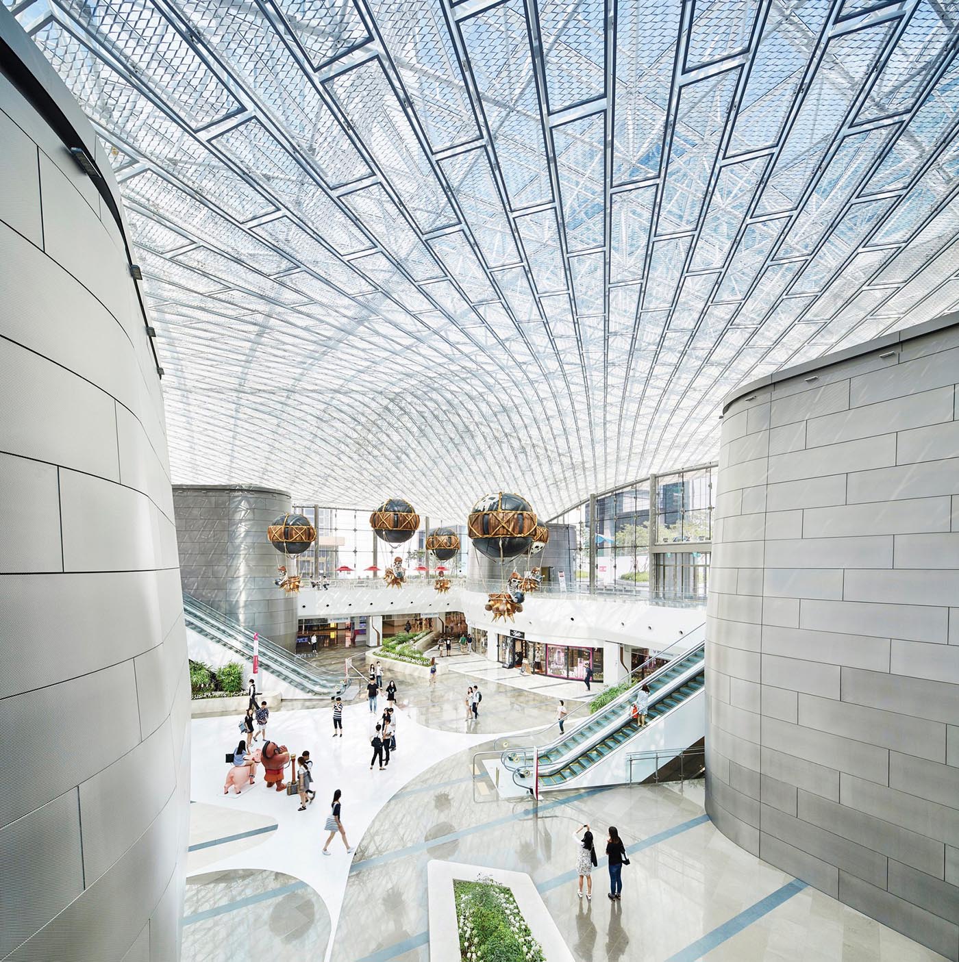
Architecture website Architizer’s A+ Award for the best Shopping Mall – Jury Award in 2016 has been awarded to a newly revamped COEX Mall, Asia’s largest underground shopping and lifestyle complex, also located in the fashionable Gangnam district of Seoul.
The COEX, one of Seoul’s most popular tourist destinations, occupies an enormous 85,000m2 subterranean level of a super block containing a convention centre, three hotels, a casino, a performing arts complex, three office towers, two train stations and a bus terminal that connects to Incheon International Airport.
Centred on the concept of ‘The Unfolded Sky’ – peeling back the streetscape to reveal the sky – the innovative vision for COEX was implemented by US firm Gensler through reconfiguring visitor circulation, creating new gathering places, and opening its primary focal points to daylight and views. Internal circulation is rooted in the idea of an urban river, reflecting the flow of people and energy throughout the site.
Already considered to be the best shopping and entertainment complex in the area, the new mall was also designed to hold more cultural elements so that, ultimately, it can reposition itself as a cultural platform. In addition to the expected retail offerings, game arcades and Megabox Cineplex, the gigantic mall now includes the event court where concerts and performances are staged, COEX Aquarium, with its water tunnel, and even the Kimchi Museum, where visitors can learn everything they need to know about Korea’s favourite food, and even try some of it.
- COEX, Seoul
An Unlikely Story Bookstore & Cafe, Plainville (US)
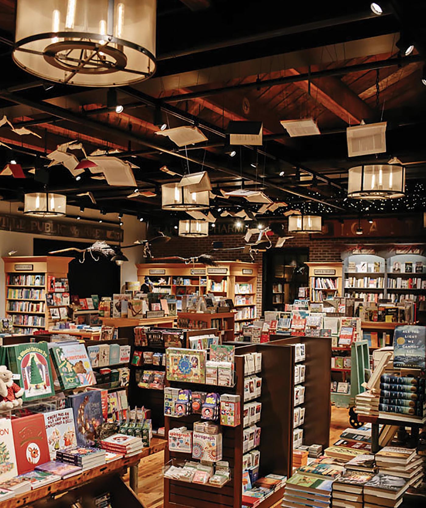
Charmingly named, An Unlikely Story Bookstore & Cafe in a small town in Massachusetts was indeed the unlikely winner of both the high-profile Specialty Store Design and Sustainability categories of the A.R.E. Awards by Shop!, the global non-profit trade association dedicated to enhancing retail environments and experiences.
Brainchild of Jeff Kinney, author of the popular Diary of a Wimpy Kid series, the store’s website describes it as “an indie bookstore, a cafe and an event space.” The exterior design emulates the original general store, 1850s Falk’s Market, right down to the porch where locals used to sit and watch traffic go by. Recycled construction materials were used for the building and furniture, and solar panels provide electricity. Upstairs to An Unlikely Story is the Second Story that hosts range of community events including book readings, art workshops, yoga, dance classes, karaoke, wine tastings and game nights for families. For decades, the Falk’s Market served as the cornerstone for the neighbourhood and An Unlikely Story is aiming to honour the building’s history with the clear mission to rejuvenate the sense of community.
- An Unlikely Story Bookstore, Plainville


