Do people get lost in shopping centres? Do they lose their car in the carpark? According to Kelvin Taylor, if we know where we are, we’re happier, more content, relaxed. There are well-defined ways of letting people know where they are…
Anthropologists understand that in the Palaeolithic period, as far back as 130,000 years, human ability to develop and maintain a spatially extensive social network was a way of ensuring continued survival. Where to find food and shelter, evade predators, or establish trading networks were all critical elements that contributed to a thriving species and a growing community. Our ability to navigate, store maps of the landscape in our minds, and form social connections, was essential to our success as a species. You couldn’t just grab your smart device and search Google Maps or dial up your family or friends on WhatsApp, Messenger, or FaceTime to find out where they were. You needed navigation skills, spatial awareness, a sense of direction, and the ability to remember and store maps (mind-mapping) of the landscape in your mind. In Palaeolithic times, if you didn’t find your way back, you usually perished. In a struggle for survival, humans have had to develop the skills to navigate their physical environment from the get-go.
The modern world is infinitely complex. I readily, admit that, at times, navigating the modern built environment can be challenging as urbanism has taken away many visual cues that aid our comprehension of where we are. Why humans don’t get lost more often is something of a miracle. We can travel through unfamiliar places, take shortcuts along paths we have never used, remember sparse details for years of places we have visited only once.
Neuroscientists understand that mind-mapping is predominantly carried out by the hippocampus part of our brain. The hippocampus doesn’t store finished maps in a traditional sense, but rather acts as a receptacle to store spatial cells such as compass direction, contextual positioning or place, boundaries, landmarks and distance. Somehow, all the different types of spatial cells work together to provide a sense of where we are, where we are going and, crucially, where we have been. Place cells in our hippocampus also take cues from a broad range of environmental elements including objects, smell, sound, colours and the geometric properties of space. All animals seem drawn to boundaries.
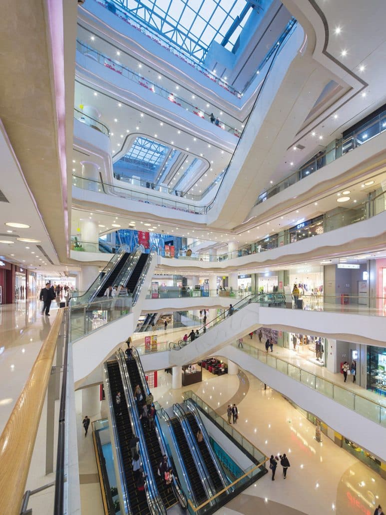
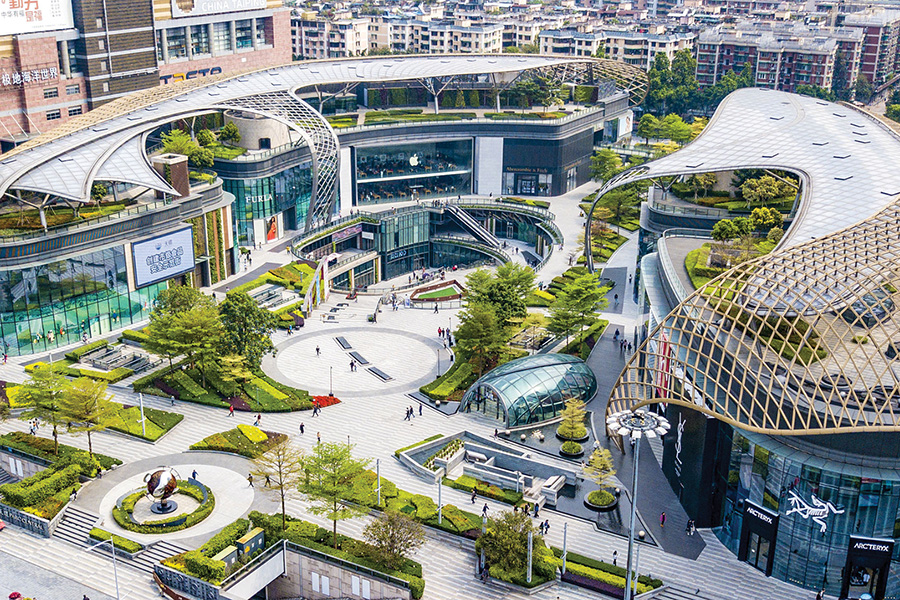
Starlight Place, Chongqing
In large urban spaces like the Louvre Palace courtyard in Paris or Trafalgar Square in London, you’ll find many more people occupying the edges of the square rather than the middle. This is especially so for the vision impaired, who navigate the edges of physical spaces.
So why is all this important you may ask? Humans have innate spatial awareness that has been developed to not only help us find our way, but to also connect us to our environment, our social structure and foster wellbeing.
The rise of GPS-enabled devices to assist navigation, while providing a heightened level of convenience, can inhibit our cognitive faculties through the decline of instinctive behaviours that have helped guide us for centuries, if not millennia. In other words, the more we rely on technology to help us find our way, the worse we get at being able to self-navigate, adapt and utilise our natural skills of spatial awareness.
If we are unhurried, comfortable and relaxed, it is more likely our emotional state will be calmer and more regulated. Endorphins kick in and we have a heightened sense of emotional balance and wellbeing.
The designers of our built environment – architects, interior, landscape and lighting designers, and those that develop strategies and plans to assist people move through spaces, such as traffic engineers and sign consultants – have an obligation to create solutions that assist, not hinder, overall human wellbeing. The American Institute of Architects has set in place a Framework for Design Excellence that represents the defining principles for good design in the 21st century. The framework seeks to inform progress towards a net zero, equitable, resilient, and healthy built environment. Good design in the built environment reduces energy while improving building performance, function, comfort and enjoyment. Good design supports health and wellbeing for all people, considering physical, mental and emotional effects on users and the community.
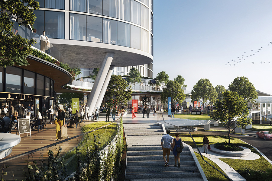
The Aedas-designed Chengdu Damofang project represents the future of Chengdu by utilising personalised technology and aesthetic scene creation as its design concept. In view of the rising aesthetical standard nowadays, the project is designed to focus on spatial planning based on developing a sense of experience and ambience.
Aedas Global Design Principal Ken Wai says, “By incorporating art and culture into commercial, the project is providing consumers with a vibrant, personalised and immersive shopping experience”.
Themes, culture and wellness are logically presented and distributed throughout the interior, which has overcome the site’s constraints and blurs the boundary between indoors and outdoors.
Specifically speaking to making spaces easy to navigate, designers need to consider the human brain function of how we find our way and interpret these elements into a functional design response. Disorientation can happen anywhere, but it is more likely in places with few standout features and landmarks, restricted window views and limited sightlines. Hospitals, airports and shopping centres hold a reputation for being challenging and distracting environments in which to navigate. In a contemporary setting, shopping centres should include a more organic structure, making it easier for the user to find what they are looking for without frustrating them so far into leaving. These organic circulations should be interlaced with congregation areas such as cafes, leisure areas and green spaces as on evidence at the Benoy designed Parc Central, Guangzhou, China. Newly designed centres integrate boulevard-like areas into their design, making the shopping aspect of the building a supporting character of the design, rather than the focus.
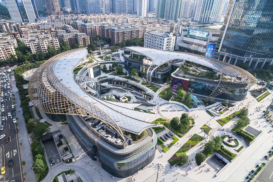
Parc Central, Guangzhou
Landmarks are essential for our sense of direction, just as boundaries are essential for our sense of place. Take the example of The Grove in Los Angeles, where a lush garden entrance welcomes visitors, making them feel like they’re entering a vibrant urban oasis. Designing with clarity and following the ‘form follows function’ mantra, designers can create navigation systems that are clear, effective and predictable. Best practices to help this include;
- Design patterns – create a system approach with easily recognisable elements
- Visual hierarchy – organise elements according to importance
- Progressive disclosure – guide with breadcrumbs from one point to the next
- Universal design – design for all people of all abilities (physical, mental, emotional)
- Integration – adapt across analogue and digital applications.
Technology plays a key role in connecting humans to their surroundings as well as meeting their societal needs. The term ‘location awareness’, while initially being coined to determine a static location, is now being extended to reflect movement, and this is where the use of technology can assist if we are seeking to discover a person’s location via, for example, a location-aware mobile phone.
Location awareness can assist in connecting a retailer to a consumer such as by publishing a user’s location to appropriate members of a social network, and allowing retailers to publish special offers to potential customers who are near the retailer’s locality.
The average human is exposed to more than 10,000 messages each day. As we go about our daily routine, it is critical for us to do so without unnecessary encumbrance such as environmental clutter, confusing spaces and poorly designed visual communication. Navigation should be simple and intuitive, whether it is in the built environment or digital media environment. By following the four golden rules — knowing where you are, what you can do next, where you are going and looking back — designers can create user interfaces, be they analogue or digital, that guide people efficiently and smoothly towards their goals. Without a cognitive map to remind us we’re in a place we’ve been before, the world would be unknowable. But knowing where we are is not enough. We also need to know how to get to places and how to follow a route to a destination.
Deep down, we are all wayfinders, with innate cognitive equipment we need for discovering the world around us. Being human, we don’t always think like a ‘satnav’, and are more inclined to feel our way around spaces, precincts and neighbourhoods, favouring routes that we know, or prefer. New York designer, Archie Archambault has created maps of more than 60 cities based on the notion of reflecting human mental maps, calling his approach gestural cartography.
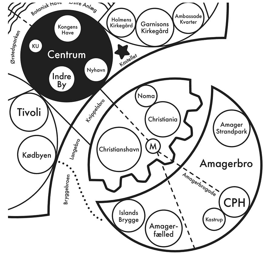
Archie Archambault map of Copenhagen
Archambault states, “Research indicates that GPS’s are hindering our ability to create mental maps of our surroundings. My maps aim to install a ‘Map from the Mind’ for each city, simplifying structures and districts in the simplest terms. Humans have loved circles for millennia. Our eyes (circles!) love looking at them.”
Archambault’s gestural map of London or Copenhagen is stripped back of detail, devoid of true scale, and reflects people’s actual experience of place, rather than raw geometry. The creators of Legible London have tried this by incorporating 3D drawings of buildings on their signs, making it easier for pedestrians to become locally aware.
Our physical surroundings influence our behaviour and affect us emotionally. We are explorers to the bone, and our spatial abilities, despite our modern dependency on GPS, are fundamental to what makes us human.
This article by Kelvin Taylor, Project Director at Diadem is published in the latest edition of SCN magazine.


