There was a time, not too long ago, when the major debate in our industry was all about the ‘boxes’ we’d created, with the entire action being on the inside and a soul-less concrete façade on the outside. Sydney City Council is calling for the ‘activation’ of shop-fronts at street level. Tony Quinn looks at the issue and finds other solutions to simply activating shop windows!
Recent experience dealing with Sydney Councils has prompted me to research and write this article. Council planners are fixated with the desire to provide street activation on all elevations of buildings. As we all know in retail, this isn’t always possible, particularly with major boxes and especially the supermarkets as they need walls for shelving and freezer cabinets. It is not something new, but it prompted me to provide examples to several councils to show that shopfronts aren’t the only face to present to a street.
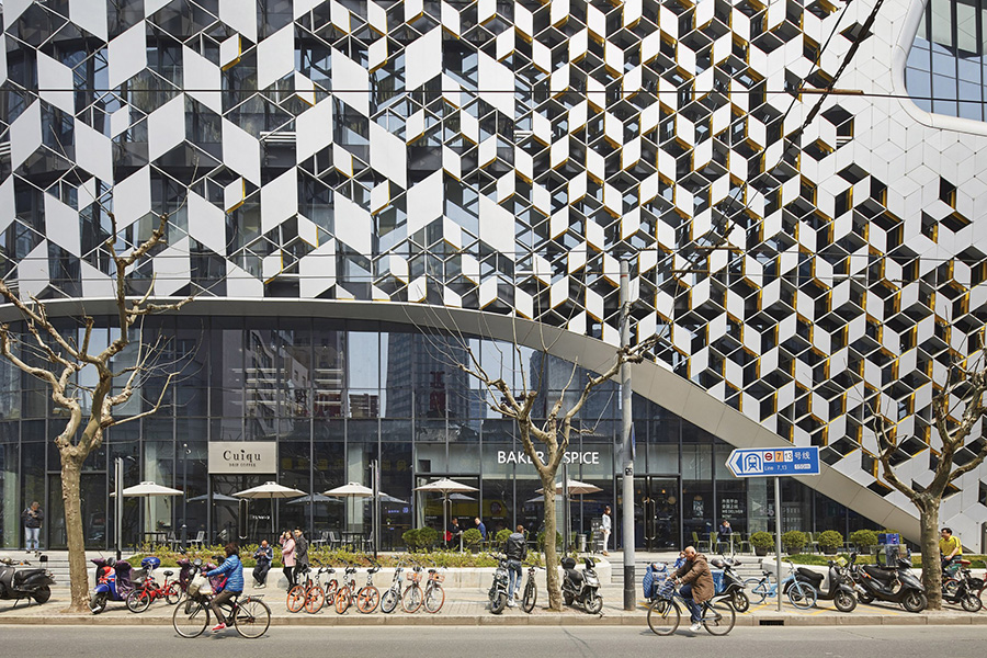
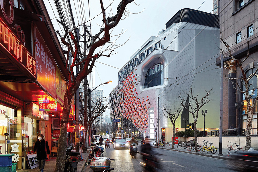
Lane 189 in Shanghai by UNStudio
Don’t get me wrong, I am not an advocate of blank walls either, but there are other ways to treat buildings that aren’t necessarily active with shops. There are of course plenty of other building typologies due to their function that don’t have complete active edges like museums, exhibition buildings, sports halls and auditoriums that are equally inward facing.
Here are some great retail examples from around the globe where the building is a contemporary object and read as a whole and it’s not just about street level.
Lane 189 in Shanghai by UNStudio is a seven-storey shopping centre in the heart of the Putuo district set among a diverse mix of old and new buildings. UNStudio’s design was inspired by traditional patterned screens that adorn many of Shanghai’s buildings. The screened façade of diamond shaped aluminium panels follow a hexagonal grid in a seemingly random pattern, creating a surface that is partially opaque and see-through.
“The design incorporates elements of old Shanghai through geometry, pattern and materialisation and combines these with a contemporary urban experience, thereby creating a destination with a distinctly Shanghai feel,” the UNStudio design team said.
The façade grades from large to small components, exposing to the inside and to the outside gradually across its surface. It’s organic in shape, with the majority of its surfaces curved with large sunken windows. The building contains a mix of shops and restaurants and office spaces around a curved void.
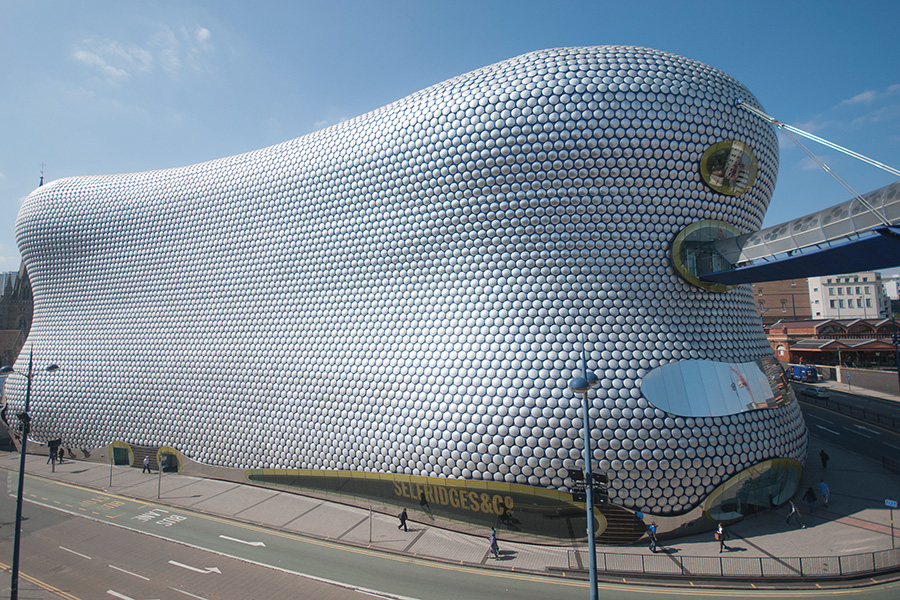
Selfridges Birmingham Bullring
Another retail building that’s world renowned is the Selfridges Department Store in Birmingham UK and part of the Bullring centre built and opened in 2004. It won multiple awards including the Civic Trust and RIBA Award for Architecture.
Selfridges’ then CEO, Vittorio Radice, wanted a distinct design approach that would set the store apart from the rest of the development and become an instantaneous recognition for the brand. Well he got his wish because the building is visited as much for its exterior as it is for its retail contents.
The façade comprises some 15,000 anodised aluminium discs mounted on a blue skin membrane underneath and wraps around three street frontages barely punctuated by shopfronts.
Another beautiful ‘object’ building is the Faena Forum development in Miami. Actually, it’s three buildings including retail, offices and a carpark all similar in style and proportion but each with their own uniqueness. The Bazaar is a courtyard building with a painted reinforced concrete façade featuring big square and rectangular windows, while the Forum has openly contrasting windows and the third, the Park is a plain multi-faceted building containing a multi-level car park. All three buildings have design elements of solid and punctuation at street level.
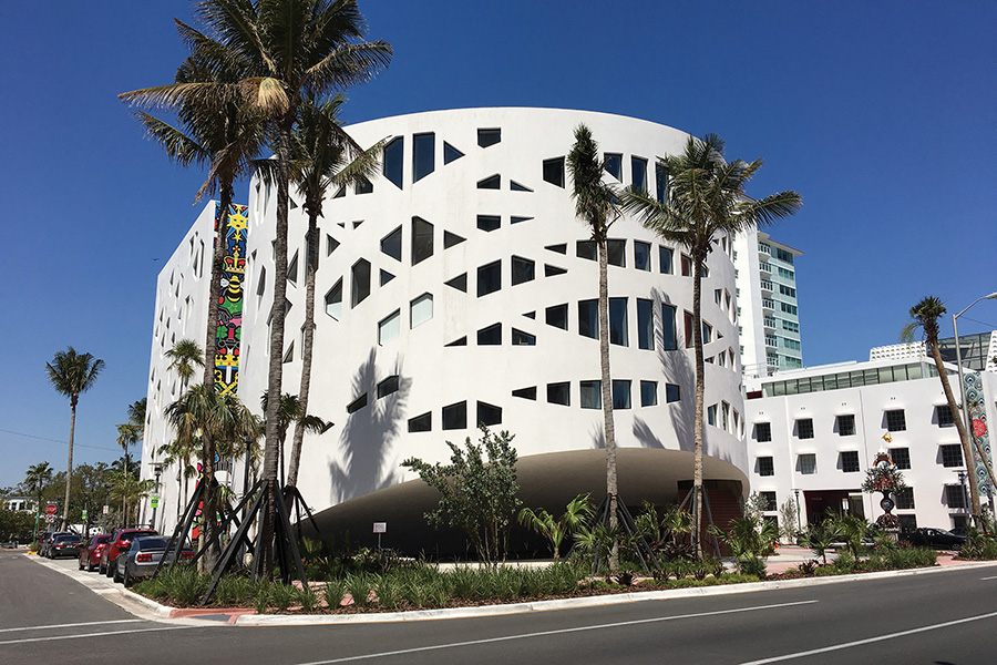
Faena Forum by OMA
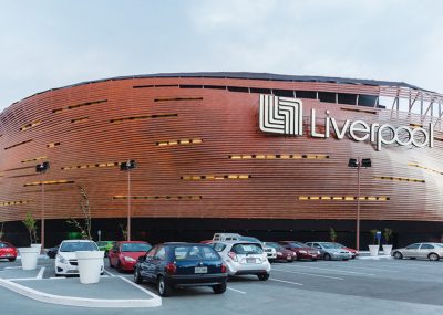
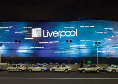
The Liverpool Toluca department store in Mexico stands on a busy 80km an hour road, and as the architect said, “it’s a place where pedestrians don’t exist” due to the busy motorway. They proposed a building that was identifiable at a glance with a simple curved volume as it adjoins an industrial zone of large metal boxes and, much like Selfridges in Birmingham, it’s at the tail end of the shopping centre. Its curved, dynamic façade establishes a dialogue of recognition with the motorway while a series of illuminated slots appear at different levels in the façade. Devoid of windows, like most department store boxes, the building contrasts with its rectangular box neighbourhood with its soft undulating form.
- Liverpool Toluca department store
- Liverpool Toluca department store
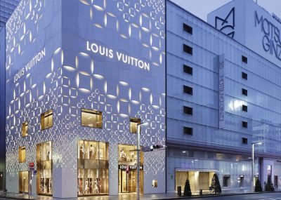
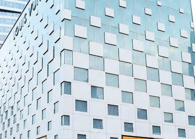
On to France for the next example, to the Gallery of Les Océanides Mall in Arcachon. This has taken the ‘dumb’ box and treated its façade as a reflection of its seaside resort town with its wave like form and recesses resembling buildings. It’s a simple, playful and attractive form with an internalised mall made up of supermarket and specialty shops. Louis Vuitton stores around the world have taken the brand to a new level with its ‘jewellery box’ buildings, many of which have surprisingly minimal shopfronts on the street.
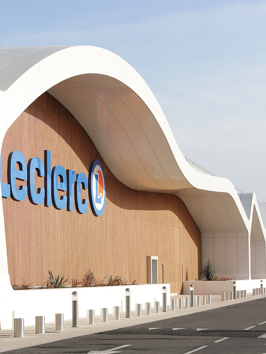
Gallery of Les Océanidies Mall, Arcachon
By way of comparison in building typology, as mentioned earlier, museums tend to be inward focused and don’t provide street activation but can be wonderful additions to the street and public realm. A cracking example is the Broad Museum in Los Angeles created by Diller, Scofidio and Renfro, which features a white honeycombed veil made of fibreglass reinforced concrete. It wraps the building from roof to ground over its three storeys and is as much pop art creation as some of the works it houses. The museum sits directly opposite the Disney Hall by Frank Gehry and has greatly added to this once seedy section of Los Angeles.
So when councils say provide shopfronts and street activation, push back with the response that it is not the only solution.
- Louis Vuitton Tokyo by David Ano
- Louis Vuitton Shenzen by David Ano


