Is the time of the ‘architectural brief’ at an end? Will it be replaced by a Pinterest board? According to Susanne Pini, the Pinterest trend is producing ‘sameness’, and creativity in design is under threat!
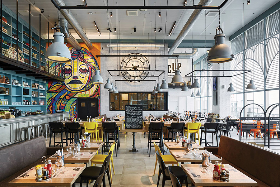
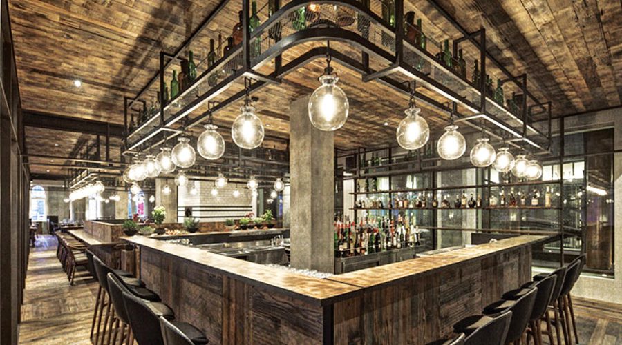
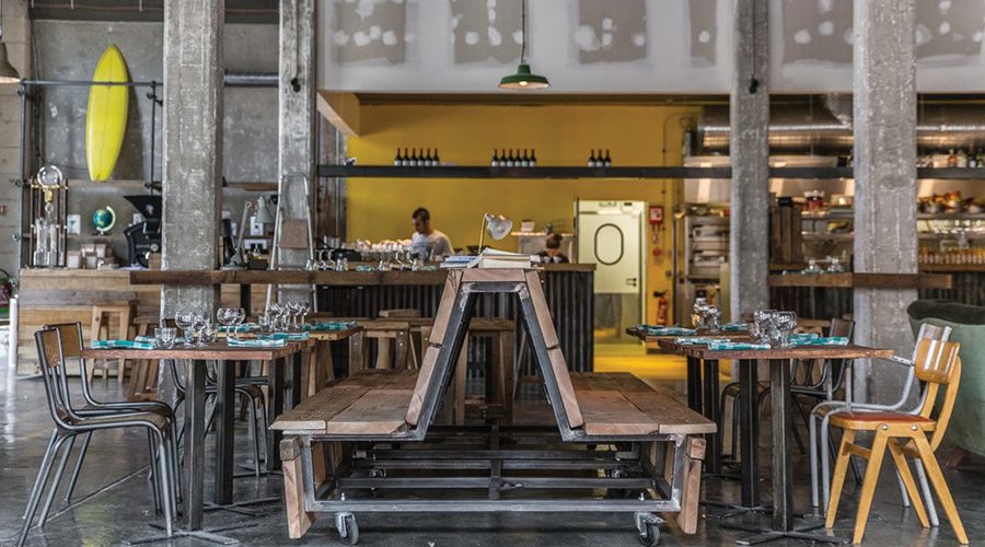
Industrial furniture, stripped floors, reclaimed wood, Edison bulbs – is everywhere really starting to look just the same? Wherever you go these days, seemingly hip, unique spaces are starting to look alike, whether it is bars, restaurants, fashion boutiques and even offices. How can all that aesthetic homogeneity possibly be cool?
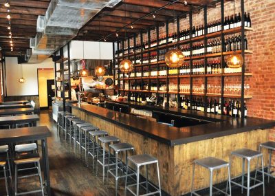
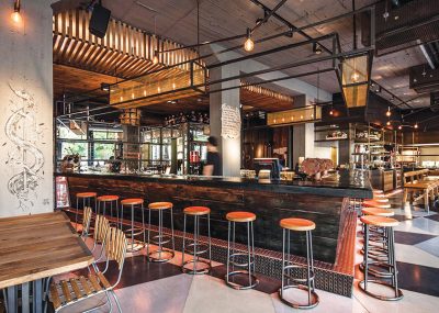
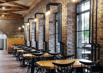
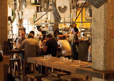
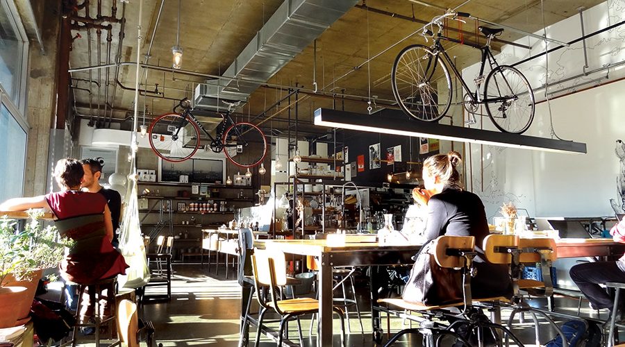
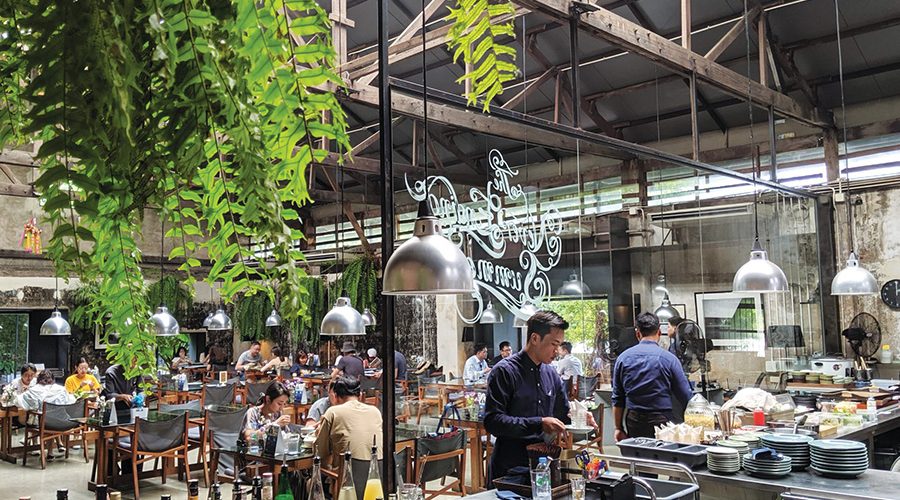
A coffee shop in Brooklyn looks the same as its counterpart in Bangkok, Beijing or Sydney, anywhere, really. Every café has a grandma-chic armchair, potted plants, wide windows and austere pendant lighting. The bars have bare-brick walls, polished concrete floors and encaustic tiles. They all follow the industrial loft aesthetic whether they are located in an old factory, an Art Nouveau building or modern high rise. Compare them and you might not even know you’re in different spaces.
It’s no accident that these places look similar. Though they’re not part of a chain and don’t have the same corporate design directions, these cafés, bars and restaurants have a way of mimicking the same so called “hipster aesthetic”, the style, as defined in the recent article in The Guardian, “obsessed with a superficial sense of history and the remnants of industrial machinery that once occupied the neighbourhoods they take over”.
The Brooklyn-based writer Kyle Chayka famously dubbed this style “AirSpace” and noted not just that all coffee shops are starting to look the same, but that cafés resemble work spaces, shops, bars, hotels and everything else.
“AirSpace” is marked by an easily recognisable mix of symbols – like reclaimed wood, Edison bulbs and refurbished industrial lighting – that’s meant to provide familiar, comforting surroundings for wealthy, mobile Millennials, who want to feel like they’re visiting somewhere “authentic” while they are away from their urban enclaves, but who actually just crave more of the same. You can hop from cookie-cutter bar, café to shops and hotels, and you’ll be guaranteed rustic interiors, sans-serif logos, familiar looking patrons, avocado toast and craft beer and enough Instagram likes, but what you won’t get is anything different or actually unique. On one hand, this enables us to feel at home anywhere in the world, but it simultaneously erases the authenticity of our experience of a place and transforms the world into a collage of franchise interiors. It’s possible to travel all around the world and never leave AirSpace! Who’s to blame? Pinterest and Instagram!
Database of intentions
A “creeping sameness” is besetting the planet, prominent New York architect Vishaan Chakrabarti argued recently in a talk at the TED conference, a trend he says threatens to rob cities and places of their individuality. Of course there have always been trends in architecture and interior design, in food and fashion, and they generally relate to the zeitgeist and the society they originate in – think of Art Deco style sweeping luxury hotels and cruise liners in the 1930s. But this is different, in both speed and scale. The globalisation of information has led to the real-time globalisation of styles and the viral efficiency with which information about new interiors is spreading has led to a superficial experience of them. Ideas are usually copied before the creative concept is truly understood and reinterpreted in accordance with the environment, local character, or soul of a place. That is why more and more interiors look as if they are part of a global franchise that is in no way connected to the location it is in.
The technology has influenced almost every aspect of our lives, not only online but it has also shaped our physical world, so quickly and intensely that many of us didn’t even notice until it was too late. Smartphone apps, information overload, social networking and our tendency to share photos of everything with everyone have gradually created an instant society. Pinterest and Instagram, in particular, are affecting our visual perception like no other platform, to the extent that Pinterest design has become practically mainstream, and “Instagrammability” is fundamental. Users distribute literally billions of photos, spreading trends, popularising places, and ultimately, influencing built and designed environments. Taste is becoming globalised, as people around the world share their aesthetic aspirations on the same social media platforms and as algorithms shape which content we consume on our feeds and apps, we all learn to desire the same things, which often happens to involve industrial lighting and reclaimed wood!
Architecture is rapidly becoming saturated from the inside out, but no doubt though, with its availability of an unlimited number of examples, Pinterest or the ‘database of intentions’ so called by one of its founders, if used in the right way and in the right context, can be a great tool for both architects as well as clients. Nowadays Pinterest boards can help in getting to know the client as almost all of them in recent years tend to produce a Pinterest board to convey their requirements. This is not bad by itself, since it provides quick insight into the aesthetics of the client. If, however, it serves as a collage of desires that we are expected to translate into the project literally, then this might become a bit of an issue. As with trying to create a so-called Pinterest House, it’s not the individual parts that are a problem, it’s ‘the Frankensteining of them into a trend beast’, to quote the famed article by The Architectural Digest. Social media has altered clients’ expectations as they have shifted from thinking about design to envisioning new ways of life and, as we all know, the gap between expectations and reality can be very wide indeed.
Picture perfect
Investing in the new project by copying aesthetic trends offers some level of certainty that the concept will yield success as it has had in hundreds of other locations. However, with the current global trends developing faster than ever before and dying out just as quickly, what happens when this trend gives way to yet another new instant global trend?
Our experience of the space we are in corresponds to a variety of factors that must be thoroughly researched and defined before the first step in design is taken; otherwise, everything is reduced to the choice of fabrics, hardwood floors, and the colour of the walls. This is the final stage, the decoration, the variable part of the entire project, and certainly not the key to good interiors. Undeniably though this element is important as it makes the space very photogenic and significantly impacts the number of ‘likes’ – but the essential difference between these re-Pinned, Insta-ready spaces and truly high quality interiors is the unique spatial experience, architectural integrity and improved user experience that a well-designed space provides. “Instagrammable” basically means photogenic and, in reality, every space inside a project has to be ‘Instagrammable’. That basic notion of creating photogenic architecture is certainly not new, since, like photographers, architects and designers are always considering what will visitors see when they look at the building, inside and outside and how we can engage, excite and surprise.
Originality is risky and those who dare to be original will likely succeed, while for those who are a bit too late, the investment might not pay off.
In today’s highly competitive retail market it is no longer sufficient to simply have well-priced, well-displayed products in a well-located, well-designed store; instead it is a strategic imperative to design a store experience that is meaningful and differentiating. From an architect’s perspective, creating that unique physical or spatial retail experience notable not only for its beauty but also for its distinctiveness represents a challenge and it calls for a detailed market analysis and unique insight to identify aesthetics that would produce both originality and a successful concept. Apple is a perfect example. Apple stores are successful because of the look but what many retailers miss is capturing the intangible elements of the experience that are behind the aesthetic. The Apple look is successful for Apple but it’s not translatable, because a store today is a place where you activate your brand and this store is the perfect representation of what this brand stands for.
Beyond Pinterest
Retail is an industry that is heavily dependent on metrics. However, in this increasingly omni-channel world, traditional metrics such as sales per square metre are becoming less meaningful. The importance of design to retail success, on the other hand, even though difficult to quantify, has never been greater. Whether choosing which café to go to or deciding whether to buy a dress in a store or with two clicks online, this decision, be it subconsciously or consciously, is largely influenced by spatial experience, The consumers, although increasingly going online, still respond to shopping experiences that are somehow perceived as “special”, which also often implies uniqueness and local relevance. In other words, it’s not what you buy, it’s where you buy it.
By definition, design is a creative and exploratory process and looking into the future we try to envisage the change that comes with reinvention and evolution and how that will impact fast-paced retail environment. We consider the range of different elements, from societal shifts, such as changes in behaviour, demographics and social norms to technology and business trends. Thus, creating the best possible retail experience certainly means going far beyond looking at pretty Pinterest pictures. The key is context, since contextualisation helps retailers to reach the right customer, in the right place, at the right time, so central to this approach is understanding your buyers, and what makes them tick.
We have to explore shopper psychology, human tendencies, retailer’s needs and objectives, sales figures, traffic flows, branding strengths and fashion trends.
Consequently, this kind of holistic design for the multi-layered customer experience requires a variety of stakeholders that will have expertise in fields such as design, research, anthropology, psychology, economics, marketing and finance, among others. Only such multi-disciplinary teams can break through silos and foster cross-disciplinary collaboration to deliver a comprehensive targeted retail design by providing engaging, convenient and meaningful customer experiences which is crucial to a truly successful retail strategy.


